Dear David,
HM Treasury Chart on inflation
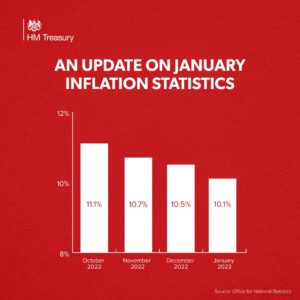
I am writing to you about a graph posted on the @HMTreasury Twitter timeline on 15 February that shows the annual inflation rates according to the Consumer Prices Index (CPI) from October 2022 to January 2023. This was an update to a similar graph posted on 19 January:
We consider that the way the tweet presents this data to be misleading. The graph gives a misleading impression of the scale of the deceleration in inflation, due to the y-axis beginning at 8%.
Guidance on data visualisation from the Government Analysis Function is clear that when presenting data on a bar chart, the y-axis should always start at zero. The guidance notes that broken axes are particularly likely to mislead when used on bar charts, where the relative size of the bars is displayed so strongly. This would still be the case had the axis been labelled clearly with a break to signify the gap.
An important role of data visualisation is to aid understanding of trends in data by showing them in their relevant policy context. This tweet refers to the intention of the Government to halve the rate of CPI inflation over the course of this year. The range used on the y-axis for this graph excludes this target rate of inflation, making the chart of little use in visualising progress towards the target.
Given that the Office for National Statistics produces several measures of inflation besides CPI, it would also have been helpful for the source of the data to be given more clearly, either in the image or a subsequent threaded tweet.
The Chair of the UK Statistics Authority has previously written on this subject. It remains important that communications teams within departments consult their Heads of Profession for Statistics before publishing high-profile numbers or data visualisations of this sort.
I am copying this letter to the Chief Executive of the Government Communication Service.
Yours sincerely,
Ed Humpherson
Director General for Regulation

