Since the start of the 2024 UK general election campaign, we have received several cases regarding the presentation of political support statistics in election campaign material – in particular, the use of bar charts in leaflets.
As the regulator for official statistics, our role is to support confidence in statistics published by government bodies. Data on the size of political support are generally sourced from polls or results from previous elections which do not constitute official statistics.
Concerns about the presentation of political support statistics in bar charts have been expressed for many years in many places in many elections. This statement highlights two relevant principles of good data visualisation that campaigners would be well advised to adhere to if voters are to have trust in the information they present.
First, when statistics of this sort are presented, the material should be clear about the definition and source of the figures being presented and the date at which they were produced – for example, whether they are derived from past general or local election results, or from opinion poll data. There is often a debate about whether previous general election results or more recent local election results are a more appropriate guide to the electoral outlook in a particular area – that is a matter for psephologists and campaigners to debate, but either way it is important for the source and vintage of the data being presented to be clear.
Second, polling or election results data should be visualised in a way that does not mislead the average reader about the relative support for different parties. In general, the size of the bars in charts of this sort should directly and accurately reflect the number or proportion of votes being cast or the opinion poll support being registered, rather than exaggerating the closeness or distance between the support for particular parties. Starting the vertical axis for such charts at zero for each party is generally advisable in this regard. Some good and bad practice is illustrated below.
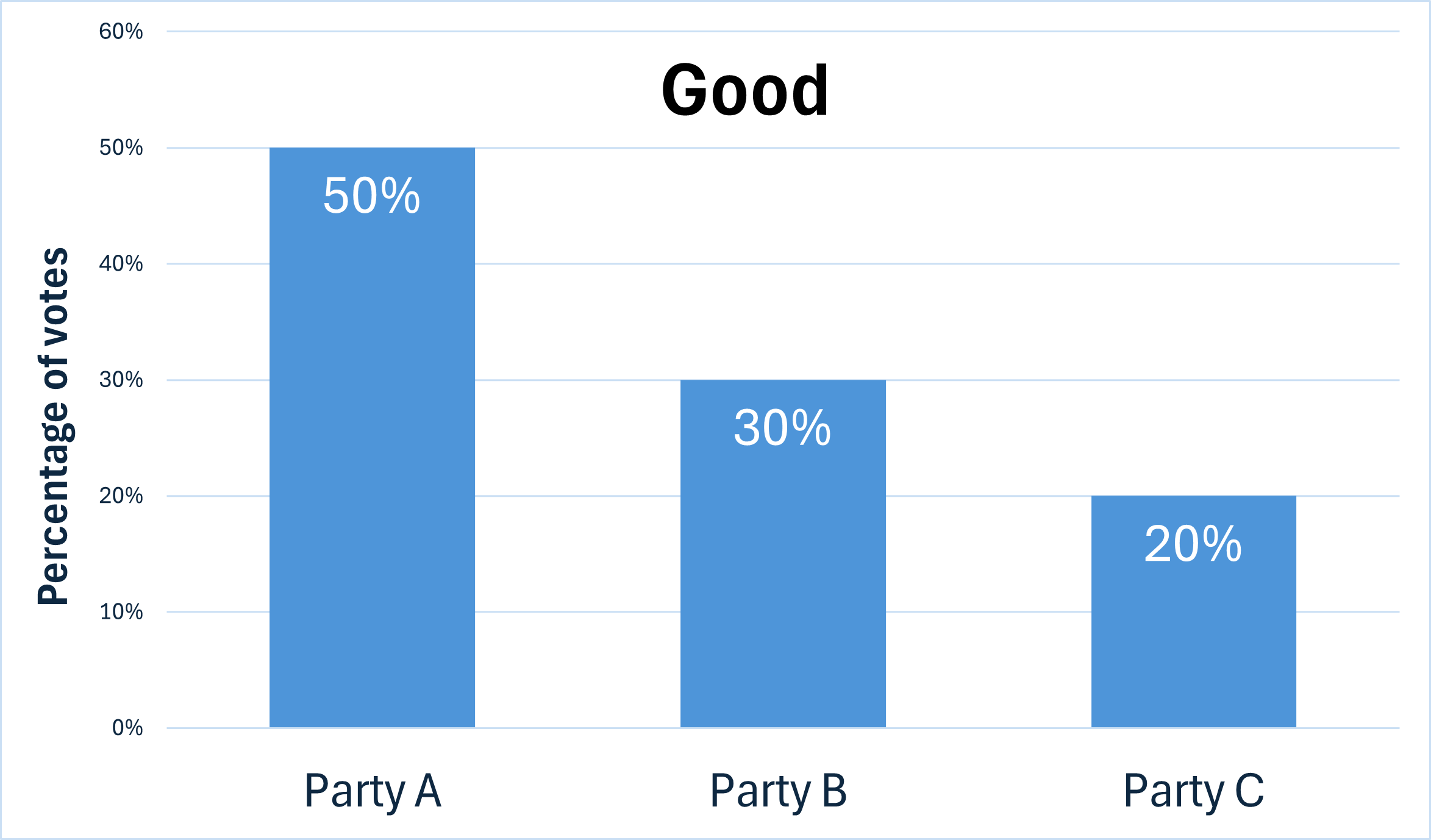
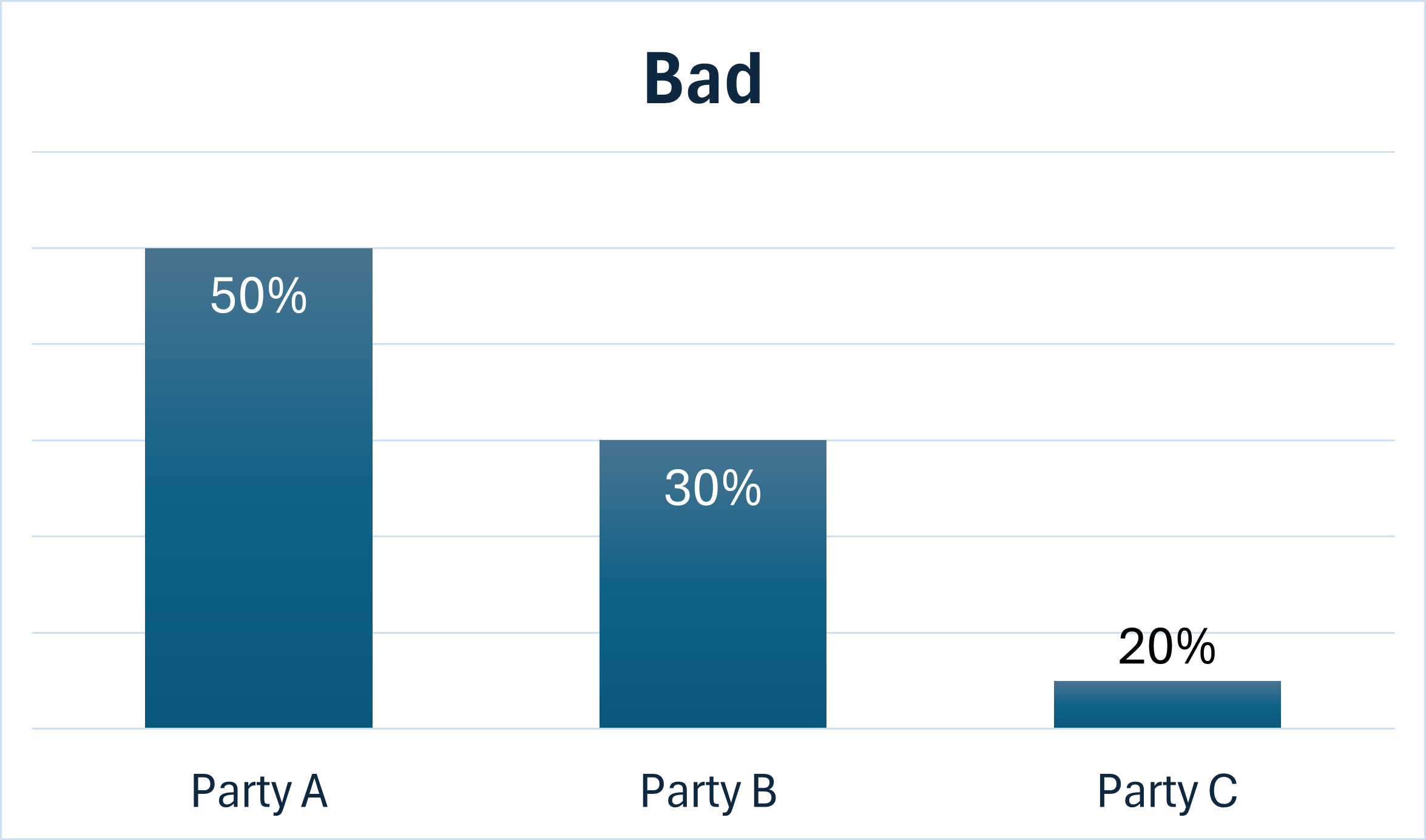
The images above show two bar charts. The first chart is labelled “Good” to demonstrate good practice. On the “good” chart there are three columns plotted showing Party A at 50%, Party B at 30%, and Party C at 20%. The axes are clearly labelled and each bar is presented to scale. The second chart just below is labelled “Bad” to demonstrate bad practice. This “bad” chart has the same percentages plotted for the three parties. However, the bar for Party C is not relative in size to the other bars, appearing to be around 5% despite the data label saying 20%.
We would encourage those with concerns to note guidance on the Electoral Commission website that: “If you have concerns or complaints about the content of printed or online election or campaign material, you should contact the political party or candidate who published it.”
For more guidance and support regarding the use of statistics in election campaigns, visit our election hub. The BBC has also produced an article on this issue titled Bar chart wars: What to watch out for on leaflets telling you who can win your seat