How official statistics producers need to embrace vulnerability in a time of crisis: ISI World Statistics Conference 2025 keynote speech

Director General, Ed Humpherson, recently gave the keynote speech at the ISI World Statistics Conference about how official statistics producers need to embrace vulnerability in a time of crisis. Watch the full keynote speech, or read the transcript below.

“Those of you who have been sitting here for a while and looking at the stage might have noticed that I’ve brought something with me, or a pair of things with me, in fact. You might think of them perhaps as being a prop for my talk, or perhaps you might think of them as being a gimmick. What I’d really like you to think of them, though, is perhaps a symbol, a token, a representation of openness, and a vulnerability. Or even think of them as a gesture by me as your speaker this morning to be open enough to leave a pair of my shoes on the table.

Because that’s what I’m going to talk about today. I’m going to talk about openness and vulnerability and how central they are to you, to us, and our identity as people who care about statistics. That’s my main point. I’m going to unpack it through the lens of various ways of looking at the world various lenses but talking about other things as well.

I’ve been struck, and I’m sure many of you as well have over the course of this week, in amongst all the great positivity about developments that statisticians around the world are putting into place, a kind of an anxiety. An anxiety that we live in times which are difficult for people who work in official statistics. I won’t enumerate all of the examples that might lead us to that conclusion, but you will have heard people talk about the threat of misinformation, political manipulation and political interference, quality challenges.

And it has struck me that people here from an official statistics background might themselves be feeling vulnerable in the face of this poly-crisis, this multiple series of crises. What I want to persuade you of is that actually we should not let any crisis go to waste, and here is an opportunity for people who produce official statistics to demonstrate our secret sauce. Our secret sauce is openness and vulnerability. That’s the point of this talk.

A picture of a pair of shoes outside a house

But I’m going to begin somewhere else. I’m going to begin on the streets of the town I live in, Kingston upon Thames in South London. About four weeks ago, I was walking along near my house and I saw these shoes on a little wall outside somebody’s house, I thought looking quite forlorn, in fact, a rather sad pair of shoes on their own. And my first thought was that somebody had lost them, and they had been placed there in case the parent came back to pick them, pick them up. But then I realised that as I looked around, there were other examples in nearby streets of people leaving things out outside their house. And what they’re doing is, they’re leaving things outside their house for other people to collect.

So here are three examples there are people who say, I’ve got some stuff in my house, I don’t need it, but somebody might. So I don’t know if you can see, but there’s a box here, it says ‘free’ it’s a very sort of casually presented box, but it’s got some stuff in it people might like. And here, a little basket of scarves. Somebody’s obviously getting rid of their scarves. Somebody might like them. It’s a phenomenon of free exchange. And one of my thoughts about this has been, a few years ago, I don’t think I saw this very much. I don’t think I saw people putting things outside on the walls of their house, from outside their house, for other people to take.

You also see this phenomenon on the internet – free-exchange websites where people put things for other people to take. I thought that was interesting. But I put that thought away and went back to my day job. And then I started to realise there was something connected to our work, which I’ll come on to.

But what I want to say today is this: I will start with the evolving nature of trust. Then I want to talk about official statistics serving the public good, and then my organisation’s role, and then I want to talk about the crises and how we’ve responded, and I want to close by really driving home this point about vulnerability.


The evolving nature of trust

The evolving nature of trust. I’ve been reading a lot about trust recently. The literature has revolved around a paper written in 1995 by an American academic called Mayer. In Mayer’s model of trust, he says: for person A to trust organisation B, they need to perceive that organisation B has competence, integrity and benevolence. So that’s the standard. It’s called the CIB model: competence, integrity, benevolence. What’s interesting is how understanding of trust has evolved.

More recently, sociologists and psychologists who’ve looked into this say that over time, of those three, benevolence is becoming more important. That instead of trusting somebody because of their competence, or their integrity, you most need to trust that they are benevolent towards you. That they share your interests and they act in your interests.

The second element of this evolution is the observation that trust is shifting from being something which people look upwards to institutions to provide – the state, the church, a charity perhaps, into something which is more relational, more horizontal, more equal. It’s to do with interpersonal relations of shared equality, not of hierarchy. So these are two ways of thinking about trust. One is a shift away from just competence and integrity towards benevolence being more important. And the second is this shift from institutional and vertical to horizontal and relational.

The ‘shoes outside the house’ is an illustration of that, because I’m pretty certain that 15 years ago, the same people would’ve given their unwanted things to a church or to a charity to sell. They’d have gone upwards to an institution, whereas now they’re bypassing, disintermediating the institution. I also think it’s quite a vulnerable thing to do. There’s some vulnerability about putting something personal of yours out for everybody to see. So that’s the evolving nature of trust that’s going to come back in this talk in a few minutes.


Official statistics and the public good

Hold that thought while I just say a little bit about official statistics and the public good. And I have to make an apology here. The more I’ve been here this week and heard other people talk – I’ve heard Walter Radermacher say this, I’ve heard Steve McFeely say this – that maybe there’s something about the term ‘official statistics’ that isn’t quite right, that maybe that sounds too austere and too distant, too remote. And maybe we should talk about public statistics. And in the UK, the Royal Statistical Society has done a very nice body of work promoting the idea of public statistics. And I hope that in future years, if I was to do a talk again, that’s what I’d say. I’m using the term official statistics now because that’s a term that we commonly use. But just to say, I acknowledge the limitations of the term official statistics.

Anyway, official statistics should serve the public good. This is the definition we use in the UK. I won’t read it out, but it emphasises that they are public assets.

Statistics serve the public good as public assets that provide insight, which allows them to be used widely for informing understanding and shaping action.

To fully realise the potential of statistics, the organisations producing them should  place serving the public good at the heart of their work and be conscious of their responsibilities to society.

They are for the public. They’re about the public, and that is what enables them to be used widely for informing, understanding. And moreover, my organisation – which I’ll explain in a second what we do – we believe that to fully realise the potential, organisations, NSOs, official statistics producers must place the public good at the heart of their work. That is essential.

In my view many official statistics producers convey their authority as if they’re a central bank. This is a photograph of the Bank of England. It’s a very powerful, robust facade. It emphasises its national nature, there’s a flag flying on top, it’s got strong pillars. Everything about it is conveying solidity and reliability, and confidence. It’s all competence and integrity. I think official statistics producers often convey to their societies their role, their authority, in this way. They say: We have very strong methods, we have very strong data ethics, we have tremendous frameworks for statistical disclosure control. We have competence, we have integrity. What I worry about is, if I’m right that the nature of trust is shifting, then competence and integrity aren’t enough.

The far strong facade of the Bank of England, the strong facade of an NSO, does not convey warmth or benevolence. It does not convey relationship. And I think that could be a growing challenge. Lots of the things which have happened in different ways around statistics might have something to do with this, as well as the more obvious causes. So I think benevolence and openness are really very important.


The Office for Statistics Regulation

So, what’s my organisation? We’re rather unusual in the global official statistics community. Not unique – as I’ve learned very well this week from Martine Durand at the French Statistics Authority, which does very similar work to us, but we’re certainly unusual.

We are a separate body and we are responsible for setting the UK’s Code of Practice for reviewing compliance with that Code of Practice. And when we review compliance, I mean, we really review it because if we find statistics that are not compliant, we remove their accreditation as official statistics, which is quite a strong intervention. We act as a catalyst for systemic improvements. We do reports on things like data sharing or on cross-UK comparability so that a user could compare statistics in Scotland with those in England and Wales and Northern Ireland.

Perhaps what we may be most known for is that we are willing to stand up for the use of statistics – the appropriate use of statistics in the public domain. What that means is that we will sometimes make public statements about the ways in which statistics may be being misinterpreted or being misleading for the public. I think that’s maybe relatively unusual in the world of official statistics. But if you believe everything that I’ve said already, you can see how important it is to serve the public in this way.

So that’s what we do. Everything we do is built around three lenses on statistics which we call TQV: Trustworthiness, Quality and Value. Trustworthiness is about the organisation that does the producing, and I suppose this is closest to the competence and integrity part of trust. It’s about the organisation’s practices, its commitments, the ways in which it manages itself. Quality is about the data, how data are collected, how then they’re converted into aggregate statistics, the strengths and limitations, the uncertainties that surround those statistics. Value is about what the statistics mean for users in society.

So we always use this framework. Everything we look at will have a T and a Q and a V component. We think looking at any one of those in isolation will tend to only give a partial picture. So that’s TQV.

For today’s purposes, what’s so interesting about TQV is it’s really all about openness. Trustworthiness is all about being open to recognise your errors. If you find an error as a statistics producer, you don’t hide it away and think that’s embarrassing. You notify your users promptly, openly, clearly, because that is you doing your job. You always recognise the limitations and imperfections of the statistics that you produce. And you should not do that just in a very technical way, presenting your confidence intervals, for example. You do that in a way that helps a user know what they should or should not infer from the statistics. Openness to uncertainty, understanding, conveying that statistics are always an imperfect measure of what they’re trying to capture. Being honest and clear about that uncertainty. Openness to users, always having an open door to understand what users want, how they use statistics. And finally, and I think this is probably underplayed often, it’s openness to dialogue. People will challenge the statistics that are produced by statistics bodies. They will see a flaw in them. They will say, hang on, I’ve delved into your underlying data, or I’ve looked at your metadata, and something isn’t right here. Welcome that – that is absolutely fantastic. That is your best friend in terms of quality control. Be open to dialogue, debate, different voices and different perspectives. And if you’re open in all of those ways, you will be demonstrating vulnerability. You’ll be opening yourself up. You will metaphorically be putting your shoes on the table, or be putting your shoes on the street. That’s the secret sauce. That’s what TQV is all about.


Three challenges that have faced UK official statistics

So the three challenges that I want to talk about, which I think illustrate these themes in practice. The first is the way in which statistics have become weaponised in political discourse. By weaponised, I mean, instead of statistics providing an insight to a user, they get used in political debate as a way of repeating the same number over and over again, almost until it loses all its meaning as a way of sort of hammering home a simple and often misleading message. That’s the weaponisation of statistics.

Second, we know that we live in a world where users demand real-time or as close to real-time data as they can. That’s a difficult demand for statistics producers to meet.

Third, and very specifically in the UK, I’m going to talk about the challenges which have faced and are facing economic statistics, which Roeland alluded to earlier.

So, weaponisation. I’ve got a picture here of the most famous weaponised statistic in recent British political history. This is to do with the Brexit referendum. There was a statistic pasted on the side of a bus. My organisation, OSR, we got involved in highlighting the ways in which that might be misleading.

For a long time as a result of that experience, I thought that our job was to highlight something which was wrong and say it was wrong, and it was only subsequently that I realised there was a much bigger and more important story around this whole thing, which is in the phrase ‘that’s not my GDP’. For those of you who don’t know it, this is the story, it’s a real story. During the debates around whether Britain should vote to leave the European Union or not, an economist was presenting to a town hall meeting in the north of England and he said, well, one of the things about Brexit is you might want to think about the impact on GDP. And he said, ‘GDP has been rising, maybe we don’t want to endanger that’. And a lady in the audience put her hand up and said, ‘that’s your bloody GDP, it’s not mine’. And what is meant by that is, that’s kind of a big abstract number. You know, I don’t eat GDP. I don’t clothe my children in GDP. My children’s shoes are not GDP. I want to know about something which is meaningful to me.

I’ve always thought that is such a great way of illustrating the ways in which statistics, when they’re weaponised, can become remote from the people that they’re about. If people say those are not my numbers, I think we’re in trouble. So, over the succession of things I’ve listed there, starting with the UK’s contribution to the European Union, and then claims about educational performance, and then the COVID pandemic, particularly debates around vaccines, and more recently, debates about migration and debates in our 2024 general election. I’ve shifted my view from being it’s our job to highlight what might be called ‘lying scoundrels’. Frankly, I don’t think that anymore. I think it’s our job to represent the people who might not see the numbers being relevant to them. That’s the way to respond to weaponisation of statistics.


Excess demand of real time data

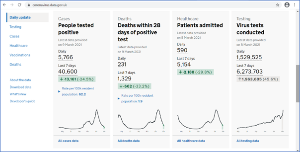
This little screenshot I’ve got here is of a fantastic tool that the UK Department of Health produced, which was a real-time COVID dashboard, updated daily, which gave real-time picture of infections, hospitalisations, deaths and vaccine rollout when vaccines came. You could visit it, you could click down to an incredibly low geographical area. Updated daily. It was incredibly popular. At its peak, it had about 70 million hits a day, which is an astonishing number for a single government website on a single day.

We responded to this. You might say that a statistics regulator would, might, suck our teeth about all of this dirty data going out. You know, where’s the quality assurance on that? But in fact we really supported it. We did some rapid reviews. We allowed them to release it not at the standard time of 9:30, but at 4:00 PM, because that was the time when the daily government press statement came out. We wanted to make sure that the information was available to everybody at the same time. We continually focused on the transparency of government evidence. And, we said, you know, there’s a code of practice, which we obviously love, but the most important thing are the principles of the Code. And as long as the people producing this kind of dashboard followed the principles, perhaps the detail of compliance matters less.

The final kind of crisis is the one which is, I guess, upon us now, which is the quality of UK economic statistics. And there are many ways of telling this story. I’m going to focus in on survey response rates, which I guess has been sort of the most proximate public reason that people have become concerned about economic statistics. I have two charts here. The upper one shows that the UK has always been towards the bottom end of response rates for Labour Force Survey statistics. The UK is the heavy black line; the other lines are other European countries. The lower chart is a different survey, the Living Cost and Food Survey, showing – because it’s too small, you won’t be able to see the time period, but really, in the period more recently after the pandemic – a really significant drop off in the response rates to that survey, rendering it increasingly unrepresentative. That’s the problem: the lack of representativeness.

Our response to this process of declining quality is a different kind of openness. Maybe it’s a painful kind of openness. It’s the openness which says, these statistics are no longer as reliable as they were. As a result, we have removed the official statistics designation from several statistics produced by the Office for National Statistics. I’ve listed them there. We also did a thematic review looking at economic statistics in full earlier this year, which said: there are really significant problems, and the first step for ONS to get its head around these problems is for ONS to fully recognise them as problems and then set out plans to respond to them. It’s no good just to say, don’t worry, we’ve got a plan, nothing to see here. Open up and say there are real problems. And the great news is the ONS has done that. That’s my bottom box here. There’s an excellent recovery plan now, which fully recognises the issues, and is showing the openness which has been the theme of my whole talk.

So what have I learned from these challenges? In a sense, what’s my vulnerability that I can share with you? The first is I made a mistake earlier on in doing this job. I thought we were campaigners to defend the truth. I no longer think that. I don’t think that’s the right way to think about statistics, because it sort of puts statistics on a pedestal they can’t possibly ever sustain. What we are is we’re advocates of a kind of transparency in the use of statistics that enables an intelligent user to understand what they mean. That’s what we do. When we make an intervention, when we write to a minister, when we make a statement in the media, that’s what we’re doing. Intelligent transparency. It’s not this sort of fact-checking, truth-correction role. I’ve learned that.

The second thing I’ve learned is that in times of high demand, an organisation like mine can be a real pain in the ass. We can say, you know, you need to do things in the right way and in the right order. And I think it’s really essential that we demonstrate flexibility, that we support producers in their responses. And then the third thing is, I talked about the succession of problems with economic statistics. I honestly think we could have highlighted the problems more clearly. I think everything that has happened, we said, you know, we picked it out as a problem. I’m not sure if we did it quite loudly enough. And that, that is one of my reflections and one of the things I say in the mirror in the morning is maybe I could have done a better job there.

The key point though, through all of this is, I think what I’m trying to get across is that the technocratic distance of being ‘we are the official statistics body, we have the best statistics’. That won’t help any of you who are OS producers. What will help is openness and vulnerability.


Openness and vulnerability in practice

So I just want to have my final section to say what I think that means in practice. The first thing I think it means is, you should be on the front line, you should be out there, you should be engaging with users. There are actually some great examples that the ONS in the UK is doing to encourage citizens to respond, to see if response rates can be increased by direct and appealing engagements. The two screenshots I’ve got are of two approaches. ‘It starts with you’, is the tagline. I think it’s rather nice and although I’m not sure whether the evidence is fully in, I understand that the early signs are, it really does help. So the lesson is: be on the frontline, engage, go out there and engage. Whilst doing that, recognise, although I’ve used the word public, of course, that’s a really silly thing to say. There’s not a public; there are multiple publics. There are different people in different places, in different communities who have different interests.

And just to illustrate that, we produced a piece of work, my organisation, earlier this year called ‘Statistics in Personal Decision Making’, where we went out to both a survey panel, but also some focus groups, and asked people, individuals, how they use statistics in their daily life. And it was completely fascinating. The answer is sometimes not at all, and sometimes much more than you’d expect. But that kind of insight of saying there’s a public out there, which is not really very well served by our current notion of users being sort of experts, is really important. So recognising not a single public.

And then three things to avoid. Avoid distance. If you’re in an OS producer and you ever think like, well, we’re conveying ourselves as this authoritative, ‘best producer of statistics that there are, you can trust us because we have all of this competence’. Well, you’re probably going down the wrong path. Associated with that is don’t ever fall into the trap of thinking the statistics you produce are perfect, that they’re a perfect single point. I always get really worried when ONS will publish a statistic and some expert user will say, I think it’s flawed here. And the ONS response can sometimes be ‘this is the best available estimate, or this is using the best available methods’. I always think that’s so dismissive. Don’t find yourself saying that. It’s a mistake.

And the final one. I always wanted to be the last person in the world to have an AI component to my talks because I don’t know anything about it, basically. But then I realised I can’t really do that – we’re in the world where everybody has to talk about AI. So this is my little nod to there being an AI thing out there.

I think there’s a tendency in the data and the AI world to regard data as a block of stuff that you shovel in. And I love this image of a man shovelling coal into a steam engine. It summarises the way AI is conceptualised. I believe there’s a tendency in the big data and the AI world to think of statistics being just another thing that you shovel in and then some magic happens inside the furnace. I think we should be really wary of that, because of course, we all know that the richness comes from the insight, from the metadata, from the limitations as much as from the strengths.

So that’s my attempt to say something about AI! I don’t think it’s very convincing, but I thought I better put it in because everybody talks about AI in their presentations these days.


Conclusion

So here is my conclusion.

If trust is shifting from institutional to relational,

and the key to trust is now benevolence,

then official statistics producers need to avoid technocratic distance

and instead they must demonstrate openness and vulnerability.

That’s my argument. And just to put it another way, visually: if you find yourself thinking like a central bank, all pillars and solidity: don’t. Don’t think like that. Instead, think of this: the shoes in the street.

Thank you.”

Efficiency in Action: Improving Productivity in Public Services

In our latest blog, Head of OSR Ed Humpherson discusses measuring public services productivity in a more sophisticated way.

Efficiency reviews are a recurring feature of public administration in the UK. HM Treasury runs spending review processes that typically require departments to consider how they might become more efficient. Governments have also periodically commissioned reviews from senior business people, tasking them with finding efficiency savings. Examples include the 2004 Gershon review and the 2010 Green review.  

These reviews usually consider efficiency in a rounded way – recognising that efficiency can emerge either as a reduction in costs to deliver the same level of output or the delivery of a greater level of output for a given cost. 

But the reviews often are remembered for their focus purely on cost cutting. This is partly because of brutal fiscal arithmetic: when money is scarce, the Treasury needs to impose cost reductions. It is also often because the headlines that emerge from the reviews focus on the opportunities to cut costs. When then-Prime Minister David Cameron welcomed the Green review in 2010, he said the report ‘goes into how much money we have wasted…over the last decade’. Similarly, the Gershon review adopted a very direct focus on cost cutting through its headline: “Releasing Resources to the front line”. 

Perhaps cost cutting makes for a simpler message than the more complex “efficiency can be more outputs for the same cost” story. 

But in the long run, focusing on cost provides little insight into whether public services are becoming more or less productive. On this, the macro picture appears to be disappointing, with evidence pointing to slow growth in public sector productivity. For example, this piece by EY highlights the difference between private and public sector productivity. 

To do that properly, we need measures which relate the resources used to what’s delivered – or to put it in economic terms, measures which relate inputs to outputs. 

That’s what some new work by the Office for National Statistics (ONS) focuses on – how to measure public services productivity in a more sophisticated way. 

The traditional way to count the contribution of public sector output in many of the world’s economics is an “inputs equal outputs” approach – that is, what’s produced should be valued at the cost of production. If society puts £30 billion into education, then society gets £30 billion of value back. The trouble with this approach is that it fails to account for any increases or decreases in public sector productivity – whether resources being put in are being put to better or worse use – and this is a topic of clear public interest: are public servants delivering increasing value over time? 

For this reason, since the 2000s, the ONS has sought to measure public sector contribution by better valuing the outputs produced, both in terms of the number of outputs delivered and how these have increased in quality over time: so, for example, if the NHS delivers more procedures over time, has the average patient outcome also improved as a result of these procedures?  

This quality dimension is really important: looking at education, ministers rarely give interviews about the number of students sitting exams, but they regularly focus on whether those students earn better results. Delivering public services is rarely simply about the number of outputs: quality dominates reporting and political debate.  

This approach sets the ONS apart from many other national statistical institutes, and the direct measurement of public sector activity is one factor in why the UK’s GDP levels fell further than other countries’ during the COVID-19 pandemic – see the OECD/ONS report: International comparisons of the measurement of non-market output during the COVID-19 pandemic | OECD 

For many countries, at least in the quarterly estimates, the value of output is equal to the input; if teachers are being paid, then that is the value of output. But for the UK, the ONS was more realistic: if schools were closed with some provision being made online, then teachers were generally producing less education, even though they were likely still being paid their usual salary. Overall, COVID-19 restrictions meant education output fell, and the ONS approach reflected this. 

The ONS has now built on this approach through its public sector productivity review. This review extends the approach of valuing outputs from health and education to other sectors of government activity, including welfare administration, tax collection and public safety.  

The ONS figures show a fascinating picture – one where, for example, NHS productivity has fallen since the pandemic in the light of more-challenging workloads, but welfare administration has improved its productivity, reflecting the introduction of universal credit as a single benefit to replace multiple benefits. This is a classic productivity-improving policy when, broadly, the same output (the value of benefits paid) requires fewer inputs to administer.  

Measuring quality improvements for public sector outputs is inherently tricky. It is hard enough for statisticians to measure quality improvements for products that are bought and sold in markets, like mobile phones and computers, and there is a long tradition of methodological challenges in doing so. These challenges are all the greater for public sector outputs where, typically, there are no traded markets, and where prices cannot reveal the way consumers value the product. 

Putting that inherent difficulty to one side, though, for me, there are three benefits to the ONS approach: 

  • First, it is good to see ONS being a world leader in methodological developments.  
  • Second, the ONS productivity figures tell a more plausible story than a simple “inputs equal outputs” approach. The decline in NHS productivity seems to confirm what many other indicators tell us – a point made very well by the Institute for Government’s Gemma Tetlow in a recent appearance at the Treasury Select Committee (Q34 in this transcript).  
  • Third, and most importantly, this ONS work could pave the way for a more rounded approach to public sector productivity which gets away from the crude arithmetic of focusing on cutting expenditure. 

Let me unpack this third point further. What might a “more rounded approach” involve? The ONS figures can provide a solid base of measurement that enables government, Parliament and others, such as the National Audit Office, to track progress through time. In allowing a through-time focus, it might be possible to avoid the periodic upheaval of major reviews which have punctuated the recent past of public administration.  

And this approach might also, by its consistent nature, move away from regarding transformation as a special project, something separate from the day-to-day delivery. It might instead lead to a view of increasing efficiency and changing services as part of an ongoing and iterative process of improvement. This echoes recent evidence I presented at the Public Administration and Constitutional Affairs Select Committee hearings on the UK Statistics Authority. I was talking about the approach to transforming statistical production in the ONS and the risk that core activities can get neglected within a high-profile drive for transformative change. I explained the risk as follows: 

Transformation is a bit special and gets all the attention; the core is seen as less exciting. … the strong message is, “Do not have separate, shiny projects and programmes off to one side; align continuous improvement to the core and do it iteratively”.’ (Q153 in this transcript). 

What is a fair diagnosis of the challenges the ONS has faced maybe also provides insight at the macro level of government as a whole. Perhaps the best approaches to improvement and efficiency are iterative and embedded within ongoing delivery. 

From Trend to Tool: Elevating Dashboards with Trustworthiness, Quality and Value

The world of statistics is not immune to the rise and fall of fashionable trends. Every few years a shiny new toy emerges that will solve all of our problems…or so we think.  

One example of such a trend is dashboards. Brought to public fame during the Covid pandemic, the dashboard aims to provide information in a clear and easy-to-use format. The success of the UKHSA Covid dashboard in conveying data to the public during the pandemic demonstrated how effective this method can be for data dissemination.  

Dashboards also have other benefits, such as acting as good early warning indicators that show data changing as part of a wider picture. I like to imagine this much like the control panel in the cockpit of a plane where each button and light serves a specific function, allowing the pilots to address issues and ensure a safe and efficient flight. 

However, it is important to remember that dashboards also have some drawbacks. For example, the format often makes it harder to communicate uncertainty and can result in complex data being oversimplified. 

Whilst the initial hype of dashboards has diminished somewhat, especially now that there is a surge in interest in AI, it is clear that they will continue to be used across the statistical system. Over the past few years OSR has provided advice to official statistics producers on dashboards. We have now developed this further and produced our own dashboard guidance, aim to ensure that dashboards are produced to the highest possible standard.  

How to get the most out of dashboards 

A dashboard can be a great addition to a statistical release alongside a bulletin or article, in order to give users bespoke access to data and to help them visualise trends.   

User needs should be put at the forefront of any decision about whether a dashboard is needed and for how long it will be updated and maintained. Our ‘dashboard questions’ target the most prominent issues and challenges with dashboards and are intended to help statistics producers to consider the value of a dashboard for any statistical output. 

It is important that statisticians and analysts work closely with dashboard developers and data visualisation teams to ensure that the final product is produced to a high standard.  

Visual space can be limited within dashboards, and so there is a balance to consider between the level of information that should be included upfront and not overwhelming the user. To help with this, we have developed a three-layered communication framework that we encourage producers to adopt which is outlined in our guidance. 

Dashboards are also often used to bring together multiple sources of data into one place. A dashboard can be a useful communication tool where there is a clear user need for a dashboard as a product. Understanding how the statistics are used, and by whom, is therefore important. 

The importance of TQV 

Many of you will be familiar with the principles of the Code of Practice for Statistics: Trustworthiness, Quality and Value (TQV). We consider that these principles are universal and can be applied to almost any circumstance, including dashboards.   

Dashboards should be trustworthy (T) and present high-quality statistics (Q) that are valuable to users (V). Our new guidance, in line with TQV, is intended to support statistics producers in their development and use of dashboards. It doesn’t have all of the answers, nor cover all scenarios that producers may encounter when a dashboard is requested – but it does set out key principles that producers should adopt when making a public-facing official statistics dashboard.  

We want to encourage producers to think about the code and its pillars of Trustworthiness, Quality and Value when they weigh up the advantages, disadvantages and risks of using a dashboard to disseminate data. This, combined with data visualisation guidance from the Government Analysis Function, should give better clarity on best practice. 


We would like to thank everyone who provided their views and feedback that helped to shape this work. We are open to feedback on this guidance so please get in touch with us if you would like to discuss via regulation@statistics.gov.uk. 


Related:

Regulatory guidance: Dashboards

OSR’s emerging strategic themes for 2026-29

This blog sets out how our discussions with stakeholders, the recent focus on the performance of the Office for National Statistics (ONS) and the resulting evidence sessions at the Public Administration and Constitutional Affairs Select Committee (PACAC) have led us to reflect on our regulatory approach.

The core of our work at OSR is assessing whether individual statistical outputs comply with the Code of Practice for Statistics. ONS, which produces some of the most important statistics in the UK, has been experiencing a period of significant challenge. A key element of our role, as the statistics regulator, is providing support and challenge to ONS as it works to recover its economic statistics.

However, ONS is just one producer of the official statistics that we assess. We are responsible for providing assurance across the whole statistical system across the UK, which includes around 800 accredited official statistics. Only 15 per cent of these are produced by ONS. Our State of the Statistical System report, which we published in July, highlighted our conclusion that the system as a whole remains robust.

We have had conversations with a wide range of stakeholders about our role and our approach as we develop our new strategy, and PACAC has added an important and highly influential voice to our thinking. We have also discussed these emerging ideas with the UK Statistics Authority Board’s Regulation Committee, which provides strategic guidance and oversight to OSR.

The key elements of our proposed strategy, which will run from 2026 to 2029, are that:

  • we should continue to act as a rigorous regulator
  • we should take a systemic perspective and identify opportunities for system-wide improvement
  • we need to enhance our work to support the integrity of evidence in public debate

The Code of Practice at the heart of our work

The core of our regulatory model is setting clear standards for official statistics through the Code of Practice for Statistics, and forming judgements as to whether individual sets of statistics comply with the Code. We are currently updating the Code, with plans to publish a new version later in 2025. The new version will set clearer expectations on what statistics producers must do; will contain a better-defined statement of the framework of TQV (Trustworthiness, Quality and Value); and, for the first time, will include standards for the public use of statistics, data and wider analysis (what we call “intelligent transparency”).

We will use this new Code to underpin our judgements on whether statistics merit the status of accredited official statistics (AOS). These judgements are then reviewed and approved by the Regulation Committee, which provides crucial input into regulatory decision-making.

We take a balanced stance in forming our judgements. We don’t see our core purpose as being to criticise or undermine producers; in fact, we often highlight positive developments in statistics. Doing so can be just as effective as exposing weaknesses – because the endorsement empowers teams to continue to improve and innovate, and because it provides an evidence base of good practice from which others can draw.

We have assessed the designation of a wide range of statistics: including for example ONS’s statistics from the Crime Survey for England and Wales, the Census statistics (in separate reports covering Northern Ireland, Scotland and England and Wales) and, most recently, Northern Ireland’s public transport statistics.

But equally, we are willing to identify when statistics do not meet the standards of the Code of Practice. We have done this for several key statistics, for example migration statistics (2019), employment statistics (2023), the Wealth and Assets Survey (2025) and, most recently, National Records Scotland’s healthy life expectancy statistics.

Rigorous regulator

So what lessons are there for us to learn from stakeholder feedback, including the PACAC sessions?

Our first reflection is that we have made sound and appropriate decisions. These include withdrawing the status of accredited official statistics where appropriate.

As a result, we want to continue to act as a rigorous regulator, with the Code of Practice as our guiding light. By “rigorous”, we do not mean being harsh or critical as a performative stance. We mean that we form judgements through a clear and thorough consideration of the evidence, and that we will articulate our judgement on compliance with the Code in a clear and accessible way. The importance of clarity is something the Regulation Committee has emphasised to us in its oversight of OSR. So being a rigorous regulator does not mean that we will retreat from highlighting effective work. This recognition remains an important lever for us.

But we need to do more to make sure that the rigour of our judgements is clear in our publications. It also means that the requirements that we set in our reports should be specific and actionable. We have already made significant changes here. After we commissioned a review of our work from Professor Patrick Sturgis, we tightened the specificity of our requirements and the follow up. For example, in our systemic review of ONS’s economic statistics published in April 2025, we required immediate action from ONS: the publication of a survey recovery plan and an overarching plan for economic statistics. ONS published both on June 26th, alongside the Devereux review. And our report Admin-based Population Estimates for England and Wales, published in July 2024, also required an action plan from ONS within 3 months, which ONS duly published in October 2024.

This all points to a need for OSR to continue to be a rigorous regulator, by:

  • putting our judgements at the heart of our publications, press statements and other communications
  • setting clear requirements and showing clearly how we follow up on them
  • making it easier to see a running list of our outstanding recommendations

System catalyst

We don’t just look at individual sets of statistics. We look at the whole system of statistics, produced by people based in UK Government departments and agencies in Scotland, Northern Ireland and Wales.

Our coverage of the system is reflected in our regulatory work and our State of the Statistical System (SoSS) reports. The reports in 2021 and 2022 recognised – and in the 2022 report, celebrated – the statistical system’s response to the COVID-19 pandemic. By 2023 we were sounding a more concerned note – highlighting that resources were increasingly under pressure; that transformations of statistics should not come at the expense of quality; and the growing risk from declining survey response rates. By July 2024, our SoSS report was describing a system under strain, pointing out that the decline in response rates to household surveys was becoming critical and that there was a need to consider whether economic statistics were meeting user needs.

Our 2025 report recognises the quality challenges facing ONS, alongside other producers encountering challenges with survey responses. But this report also emphasises that the system as a whole remains robust.

The 2025 report also describes opportunities to enhance the production, communication and ultimately the value of official statistics, through a continued focus on improvement. This improvement focus includes exploring data linkage and the potential use of AI in official statistics.

In terms of our systemic impact, one of our most notable achievements has been to embed the recognition of TQV across the UK Government analytical system. This framework encourages statisticians and analysts to think not just of the data they are collecting but about giving assurance on their approach to producing them and also focusing directly on how users will want to use the statistics.

These concepts are not just a luxury. They are the underpinnings of public confidence in statistics, and they can offer a compass for statistics producers as they adapt their statistical estate to new demands.

We therefore want to continue to support the statistical system in the UK, both by highlighting key risks and identifying opportunities to adapt, innovate and improve.

Champion of evidence integrity

It is often remarked that we live in an age of misinformation and data abundance, in which public confidence in official sources of evidence may have eroded significantly.

OSR plays a role in addressing this environment of declining trust. The Code of Practice is itself a bulwark against the challenge of poor information. The Code’s new standards for the use of statistics set a new bar for how government makes information available publicly (formally called the Standards for the Public Use of Statistics, Data and Wider Analysis). We also have a casework function. Anyone can write to us voicing their concerns about statistics being potentially misrepresented or misused, and we will seek to clarify the appropriate interpretation of the statistics. And alongside our regulatory work, we conduct research to better our understanding of how statistics serve the public good.

But we are not the only organisation that addresses these risks, and official information is only part of the overall information ecosystem. So, we need to work with a range of other organisations to help support the integrity of evidence, such as the Royal Statistical Society, Admin Data Research UK and Sense about Science. And through our voluntary application approach, we support organisations who apply the principles of TQV beyond official statistics – contributing to evidence integrity more broadly.

Looking ahead

We see three strategic imperatives for OSR arising out of the current circumstances:

  • demonstrating that we are a rigorous regulator in our judgements and our communication of those judgements
  • being a catalyst for systemic improvement across the statistics system
  • continuing to support the integrity of evidence in public debate (through our work on intelligent transparency and our casework)

We will start to refine our strategy based on these three drivers, and propose a fully worked-up strategy to the Regulation Committee in autumn 2025.

As we flesh this strategy out, we would very much welcome feedback. Do these sound like the right themes? Have we identified the right lessons? What might we be missing? If you have any thoughts, please do get in touch with us via email regulation@Statistics.gov.uk

Welcoming the new Evaluation Registry

At OSR, we support good evidence that informs the public.

Our main focus is on official statistics. But we also recognise the role that evaluation plays in providing insight into what works in government policies and programmes.

That’s why we welcome the brand new Evaluation Registry, launched by the Evaluation Task Force in March 2025. The site will provide a single home for evaluations across Government.

There is at present a lot of great evaluation work taking place across Government led by researchers, economists and other analysts. They are commissioned by their department to look at what’s being done, and to create an evidence base that helps refine, improve and challenge policy.

The issue with this, though, is twofold. First, it can be difficult to know where to find and access evaluation evidence. That in itself is a huge pity. It means that the good evaluation that gets done can sometimes languish in obscurity, and the knowledge it represents may not be accessible to a wide range of people. This inaccessibility is also not in line with the intelligent transparency that we advocate in OSR – it can help underpin public confidence if the evidence that informs decisions is made fully available.

The second issue is that there is scope to increase the coverage of evaluations across Government. In 2019, the Prime Minister’s Implementation Unit reported that only 8% of the Government Major Projects Portfolio had robust evaluation plans in place (here’s a link to the report). This has now increased to 34% in the 2023/34 GMPP portfolio (here’s a link to the report), however, there is still considerable work to be done to improve the quality and quantity of evaluation on our Government’s most complex and strategically significant projects. By making the process and practice of evaluation more transparent, the website will drive greater commissioning and take-up of evaluations.

As the Evaluation Task Force’s blog published today says, the Evaluation Registry brings together evaluation plans and reports in a single, accessible site – which as of June 2025, already contains over 1750 entries!

We have a strong partnership with the Evaluation Task Force and we will work in partnership with them to support high quality evidence. In particular, while the Evaluation Task Force will maintain and oversee the Registry, the Office for Statistics Regulation will engage with Departments where there are delays in publishing evaluations. In this way, we will support transparency and access to the knowledge base provided by evaluations. And our partnership with the Evaluation Task will support Departments to use the Evaluation Registry, and thereby provide maximum value to the public.

As my blog from March 2022 states, we love evaluation in OSR. So we’re delighted to be able to support the advent of the Registry.

Related links: The Evaluation Registry: a new home for Government evaluation


Mission possible? Statistics and data in the UK Government’s mission-led approach to government

In this blog, Head of OSR, Ed Humpherson explores the role of statistics in the missions set out in the Government’s  Plan for Change, reflecting OSR’s core focus on transparency of statistics and data use in Government.

The UK Government has launched an ambitious programme of mission-led government, built around five missions and three foundations. This blog considers these missions from the perspective of statistics and data to inform the public

The five missions and three foundations are set out in the Government’s Plan for Change. The foundations are:

  • Economic Stability
  • Secure Borders
  • National Security

The missions are:

  • Kickstarting Economic Growth
  • Safer Streets
  • An NHS Fit for the Future
  • Make Britain a Clean Energy Superpower
  • Break Down Barriers to Opportunity

The purpose of these missions is to orientate and coordinate government around high level ambitions. The missions are big, high level goals, as opposed to specific Election manifesto delivery commitments. As such they provide a focus for action, and require collaboration across Departmental boundaries.

Each of the missions is underpinned by statistics. Statistics are used to: define the problem and set milestones for progress; monitor progress; and identify links and key drivers of outcomes.

At OSR we are interested in how the missions draw on and use statistics. In particular, we are keen to understand the role of statistics in the detailed mission plans that underpin each mission; and the quality and accessibility of statistics and data. This reflects our core focus on transparency of statistics and data use in Government.

The first point to make about the missions is that while they are a new tool for the UK Government, programmes for Government have already existed in Scotland, Wales and Northern Ireland for some time. These programmes are often underpinned by statistical frameworks.

For example, The Northern Ireland Executive has the Programme for Government, with four cross-cutting Missions (People, Planet, Prosperity and Peace). It’s supported by the PfG Wellbeing Framework and the award-winning NISRA Wellbeing Dashboard. All the indicators used in the Framework are official statistics.

Similar resources are available for Scotland in the Programme for Government 2025 to 2026 – gov.scot; and through Wales’s https://www.gov.wales/programme-government.

Secondly, we have considered the role of statistics and data in each of the five missions and for the secure borders foundation, drawing on our principles of intelligent transparency: asking whether the statistics available and accessible to the public, and whether it is clear what the statistics cover.

Applying these questions to the five missions:

  • The growth mission draws heavily on economic statistics produced by the Office for National Statistics (ONS). It sets two measures of economic growth as milestones: Real GDP per head; and Real Household Disposable Income (RHDI) per head. These measures are both reported in ONS’s GDP quarterly national accounts. Both measures make use of ONS population estimates and projections (see this blog by Mary Gregory of ONS) to calculate the “per head” figure. For RHDI per head, another question surrounds how easy it is for a member of the public to access and understand these figures. We are discussing both issues with ONS.
  • In addition, the growth mission sets a target for housebuilding based on official statistics. The mission targets the creation of 1.5 million new homes by the end of this Parliament. There is a clear statistic, published by the Ministry of Housing, Communities and Local Government (MHCLG), called Net Additional Dwellings, which provides a sound basis for measuring progress. The most recent release published in November 2024 covers housebuilding in between April 2023 and March 2024 in England. In addition, for monitoring progress, including specifically for the parliamentary term, Government has developed a more timely, now-cast style indicator using Energy Performance Certificate data, which MHCLG now publishes in its quarterly indicators of new housing supply statistics.
  • Net zero – there are a wide-range of official statistics available. Progress against this mission will be measured by the Government being on track to achieving at least 95% of low carbon electricity generation by 2030, in line with its Clean Power 2030 action plan. The Department for Energy Security and Net Zero publishes accredited official statistics on Energy Trends each quarter, which do track the extent of low carbon electricity generation in the UK. However, this is quite a technical area, and users at this year’s UK Statistics Assembly expressed a general appetite for statistics relating to monitoring net-zero progress and climate change to be clearer and made more easily accessible to the public.
  • Safer streets – there are lots of available data from the Crime Survey of England and Wales, and from policing statistics. But this area of the missions is seeing the most activity in terms of developing new official statistics, including the development by ONS of new measures associated with Violence Against Women and Girls. In addition, ONS is developing a new survey to understand the prevalence of child abuse in children and young people aged 11-25 years, which may also inform the Opportunities mission. The Home Office is developing new official statistics to measure progress against the target to recruit 13,000 more officers into neighbourhood policing roles (the Neighbourhood Policing Guarantee). Note that the main measures focus on England and Wales, rather than the whole of the UK.
  • Opportunities – A range of existing official statistics are available from DfE and across government to measure the four pillars that underpin this mission, although some metrics will require more detailed breakdowns of the data. DfE is also publishing additional content to support analysis and public understanding, such as ad-hoc statistics releases (including on Schools Eligible for RISE intervention) and new management information releases (including on schools in the breakfast clubs early adopters scheme). The mission has connections across the UK – in key areas like child poverty and in developing and exchanging best practice.  The education elements focus primarily on young people in England, reflecting the fact that education is a devolved matter.
  • Health – there are a wide range of health system metrics that are already available. We will consider undertaking compliance reviews of the key metrics over the next couple of years. As with safer streets and opportunities, the main milestone set out in the Government’s Plan for Change covers NHS waiting time performance in England, and therefore does not cover other parts of the UK. And it is important to bear in mind the points made in my recent blog on difference between population health and system performance.

In terms of the Safer Border foundation, the focus on migration has seen lots of statistical developments in recent years which we have covered in our regulatory work – for example, here. And the Government’s recent announcements on migration draws heavily on published statistics, as can be seen in the recent White Paper Restoring Control over the Immigration System May 2025.

Conclusion

The missions are an important feature of the UK Government’s programme. They represent a key set of commitments from UK Government, and it is important that they are underpinned by reliable and accessible data. We will do further work to provide assurance on the relevant statistics over the coming years. As this blog highlights, the missions mix some policy areas that are UK-wide with others that focus on England (housing, health and education) or England and Wales (crimes/safer streets). With forthcoming elections in Wales and Scotland in mind, we will also consider how best to help voters navigate data and statistics in the run up to these elections, as we did last year with the UK General Election – see our Election 2024 hub for an overview of our work during that campaign period. We will also consider the questions raised by this blog for the new programmes for Government in Wales and Scotland after next year’s elections.


Demand on the NHS is a poor proxy for understanding the UK’s health

I recently spent the most interesting 20 minutes of my week when I was asked to review OSR’s recently published article on health inequalities. The article itself is an excellent read, but it also led me to play around with the Fingertips tool, an online platform that allows users to easily access and analyse a range of public health data. While exploring this tool, I generated this chart:

The chart shows the prevalence of obesity in children entering reception year (those aged 4 or 5) in England since 2007/08, organised by the deciles of multiple deprivation. It tells a clear story: there is an obvious spike in obesity in 2020/21, and the spike is more significant for children living in the most-deprived areas. (The data come from the Office for Health Improvement and Disparities Health Inequalities dashboard. To recreate the chart, go to the child health domain; select Reception: Prevalence of obesity; and select Deprivation as the inequality indicator).

These data, and the story they tell, are valuable in and of themselves. But they also illustrate the richness and value of this public health data set. There is a wealth of data available on health inequalities in the UK – and that’s what I want to talk about.

There is perennial interest in health data among policymakers, the media and the public. The performance of the NHS, reflected in data, is a mainstay of political party manifesto commitments. Relevant figures are frequently quoted to illustrate the challenges and successes of the UK’s health systems.

For example, when the Department of Health and Social Care announced the abolition of NHS England, the Secretary of State for Health highlighted the delivery of 2 million extra appointments since the 2024 General Election and a reduction in waiting lists by 193,000.

Similarly, in Scotland, the Scottish Government has made new commitments to improve NHS performance. These commitments include ensuring that no one waits more than 12 months for a new outpatient appointment or inpatient case and the delivery of over 150,000 extra appointments and procedures in the coming year.

Metrics of health system performance also feature heavily in the UK Government’s missions. Its health mission is explicitly framed in terms of the performance of the NHS (in England), and its leading milestone focuses on reducing waiting times for elective treatment, with the aim that 92% of patients in England should wait no longer than 18 weeks for elective treatment.

Evidently, the focus on the metrics of NHS performance is widespread, and understandably so: these system metrics are important. Many people are concerned about their experience as a patient in health services, so it’s not surprising that so much public conversation focuses on their delivery.

Yet while these metrics say a lot about the NHS as a system of service delivery, they say less about the general health of the population – other than perhaps offering the sense that growing demands on the NHS’s services may reflect underlying health conditions in an ageing population.

But regarding demand on services as a proxy for underlying health is a poor measure at best. It doesn’t indicate whether the UK’s health is improving or worsening for different age groups, in different places, at different levels of income. (Indeed, one of the Labour Party’s 2024 manifesto aspirations was to halve the gap in life expectancy between the richest and the poorest in society, which focuses more on health outcomes as opposed to NHS performance.)

Moreover, demographic breakdowns can add significant value to statistics about the health system. In fact, these are something we often hear users request. But such breakdowns are missing from the standard metrics that summarise aggregate performance. These focus on the big national numbers – the total number of people waiting, or the total number of operations.

In short, focusing on the NHS’s effectiveness in delivering specific outputs doesn’t highlight health inequalities very well. And there is a risk that focusing on system metrics drives interventions that focus on improving these numbers, not underlying population health.

That brings me back to OSR’s review of health inequalities. This wider question of data on health inequalities is the focus of this recent review. Our article shows that there are many data sources available across the UK, as well as the Fingertips tool with which I generated the school age obesity chart. These include:

  • the online profiles tool for Scotland, which provides access to a huge range of indicators of public health, including drugs, alcohol and tobacco use, mental health, and life expectancy, and in the future will include physical exercise
  • the annual Well Being of Wales report, which places milestones like healthy life expectancy and health lifestyles alongside other indicators like income and education
  • Northern Ireland’s health inequalities statistics, which provide an annual update on health inequalities in Northern Ireland

The variety of available data tools and sources indicates that, despite the demands to report on NHS performance, health bodies are able to carve out sufficient time and resource to provide clear analysis of how health differs across the population. However, for these public health data resources to meet their full potential, they need to do more than merely exist; it’s also important that they are used and referred to in debates about health. Government, citizens and the media certainly want to understand how the NHS is performing, and there are good data that can help us determine this across the UK. But to enhance the underlying health of the nation, we need broader data that focus on people and their health – not just systems.

So, at OSR we aim to continue to focus on the high-profile system metrics – but to balance this focus with a wider perspective on public health. In particular, we want to celebrate the value and power of the available tools to understand, analyse and address the health of the population.

Because, as my graph on obesity in reception-age children shows, you can discover the fundamentals of the population’s health without ever going near a hospital performance league table.

A reason to be optimistic: sharing and linking data on road traffic collisions

In our latest blog, Head of OSR Ed Humpherson discusses how data sharing and linkage can provide vital insight into the problems and potential solutions when looking at road traffic collision data.

At the start of 2025, OSR published a rather optimistic piece on the potential for data sharing and linkage. Data sharing and linkage can yield new insights, identify previously hidden problems, and highlight what works and what doesn’t. It has huge potential to serve the public good.

But it’s also difficult to achieve, and there are still lots of frustrated researchers who have not been able to progress their work because they can’t access the data that they need.

So why are we optimistic? Partly, it’s a top-down perspective: we’ve seen progress through the increasing maturity of the UK-wide facilitation of data sharing and linkage provided by the excellent Administrative Data Research UK, reflected in programmes like the Ministry of Justice’s Data First.

But it’s also because, in some specific policy areas, there is a growing bottom-up drive to make better use of datasets by linking them to others, and enhancing the insight that they can provide.

Developments in data on road traffic collisions provide the best grounds for my optimism. The Department for Transport (DfT) publishes a long-standing data set on road traffic fatalities. The statistics show that the UK does well in international comparisons of road traffic fatalities per capita. They are based on a consistent set of categories for recording traffic collisions by police forces in England, Wales and Scotland, using a system called STATS19. They are well presented and clearly explained.

But the STAT19 data set has some limitations. The data series does not capture all traffic collisions, nor does it record all injuries. And as with all data based on police recording, the incidents recorded are those that come to the police’s attention – and not all do. To its credit, DfT is clear about these limitations in its annual statistical release.

Moreover, the picture painted by the traffic fatalities statistics can hardly be described as positive. Every fatality is a personal tragedy, impacting the families and friends of those involved in a deep and difficult way. And the long-term declines in fatalities seem to have stalled over the last decade, as shown in Chart 1 in the annual report here:

Figure 1: All road users killed in traffic collisions in Great Britain, 1979 to 2023

The chart shows a decline in road users killed in traffic collisions in Great Britain from 1979, with the decline slowing from 2013 – 2023. The chart was originally published on the Department for Transport website. The data can be found here.

So, we should welcome anything that can give us more insight into the problems and potential solutions. This is where linked data comes in. By linking STATS19 data to ambulance data and hospital records, we can get a much richer picture of collisions – where they happen; who is affected and, just as importantly, the full extent of their injuries; how the victims are treated by the health care system; and the outcomes of their treatment. And this information can in turn help answer important questions, like why it is that the reductions in fatalities appear to have stalled, and whether there are practices and interventions that can reduce collisions and increase people’s survival chances.

The potential for the linkage of STATS19, ambulance and hospital data is the basis of an excellent paper by Seema Yalamanchili of Imperial College (PDF download), which in turn was the starting point for a round table I attended in January. The meeting was convened by the RAC Foundation and took place at the Royal Automobile Club. Seema presented her paper, setting out the case for this data linkage, the barriers to linking the STATS19 data – technical, legal and cultural barriers alike – and crucially, laid out a clear plan for addressing these barriers.

The meeting at the RAC Foundation was one of the most constructive, positive meetings that I’ve attended on data sharing and linkage. It was chaired by the RAC Foundation, and included people who produce the official statistics for the Department for Transport and the Department of Health and Social Care; NHS England; policy and scientific leaders from those departments; surgeons who work in trauma care; transport and health researchers; and data governance experts.

A lot of the meetings I’ve attended on data sharing and linkage focused on setting out all the barriers and constraints. And there are indeed a number of challenges. First of all, in any endeavour of this kind, the project should test whether what it is proposing is publicly acceptable. This needs to be done through a process of public involvement that listens to how people feel about linking sensitive pieces of information.

Then there is the legal authorisation – is what is proposed lawful, and who needs to approve it? This element can be complex and time-consuming, as any researcher who has proposed working with healthcare data can attest.

And beyond these ethico-legal considerations, how technically feasible is the linkage? Do the datasets have enough common identifiers for records to be linked with a reasonable degree of confidence? How easy is it to link a record of a road traffic injury to the trauma centre where the patient is treated?

All these issues – public perception, legal context, technical data quality and linkability – are complex in their own right. It can take a lot of time to work through each of them. But underlying these substantive issues lurks a deeper issue: it seems as though the culture of data-owning organisations is not always conducive to data linking. This could be for a range of reasons, including risk aversion or a lack of incentives. Whatever the cause, the result is that organisations are less supportive of data linking than their leaders claim to be.

The RAC Foundation meeting was different from many others I’ve attended on linkage. Led by Seema’s presentation, and drawing on her paper, it focused less on the barriers themselves, and more on what attendees can do collectively to address them. We all focused on what can be done, not what can’t be done. For example, the DfT lead statistician said that, if the linkage took place, he would be keen to include insights from the linked dataset in the annual publication.

The meeting ended with a clear commitment to take the work forward: to enrich the official statistics on road traffic collisions; to link data for more insight into trauma care; and to make a difference to a societal problem that continues to devastate victims and loved ones. Within a couple of weeks of the RAC meeting, a working group involving all the key players has sprung up. All this points to a building momentum for change.

Of course, it may be that there are further challenges ahead. But this project shows that, with creativity, ambition and focus, progress is possible – and that cultural barriers to data linkage are by no means fixed. I hope this approach becomes the norm when people seek to use data to serve the public good.

So, why am I optimistic? Because of initiatives like this.

Beyond GDP: Redefining Economic Progress

Gross domestic product (GDP) is invariably a focus of debate about the state of the economy and whether this country, or any other, is making progress.

Yet it has its critics. Some complain that the focus on GDP as the single measure of progress distorts our priorities. They argue that GDP blinds us to many other important ways in which society should flourish.

There are indeed good grounds for thinking GDP is an incomplete measure of societal progress. Case in point: it has up to now omitted the depletion of the natural world, though this will be addressed in the upcoming updates to the international standards for the compilation of GDP – the new System of National Accounts WS.6 covers depletion.

Moreover, GDP does not capture lots of types of worthwhile activity that are not paid for (caring for a relative, for example) but does capture activities that are not worthwhile (like trading in illicit drugs).

Over 2024, we saw the maturing of several endeavours to address this issue. They fall into two camps. The first involves using the framework of GDP (or national accounts, to be more precise) to create a more comprehensive measure of growth and wealth. The second looks to develop adjacent measures that focus more directly on well-being and prosperity.

Let’s begin with approaches that focus on GDP.

One solution to this problem is to enrich the idea of GDP – to measure more things within the concept of the economy, like income, capital and growth. For example, GDP could measure the value of work done in the house and could incorporate the depletion of the natural world. A recent speech by the UK Statistics Authority Chair, Sir Robert Chote, highlights international work to widen what is captured as capital in economic measurement, and in particular to include natural capital.

A good example of an attempt to enrich GDP is the ONS’s recent inclusive income release. It supplements the standard GDP measures of output with measures of unpaid work, the costs of depleting the natural world and some elements of cultural wealth. The ONS summarises it well:

“Inclusive income estimates provide a broader measure of the economic welfare of the UK population. They reflect the economic value of both paid activity, included in gross domestic product (GDP), and unpaid activity, which includes ecosystem services and unpaid household services. The result is measures of economic progress that include activity and assets beyond those currently included in GDP.”

It’s an interesting endeavour, and provides some notable insights. For example, unlike GDP per person, inclusive income per person has not yet returned to its pandemic peak. In short, I applaud the ONS’s ambition in taking on this difficult and methodologically challenging work – though it has initiated a lot of debate within OSR, which my colleague Jonathan Price will highlight in a subsequent blog.

The second approach suggests that we should keep our focus on GDP more or less as it is (subject to the usual improvements and use of better data sources, as well as the communication of uncertainty; see our GDP review on this). And instead of extending the framework, it proposes supplementing it with meaningful alternative measures, including personal well-being measures, which focus on the things that GDP does not capture well. The ONS in fact provides an important foundation for these alternatives with its Measures of National Wellbeing.

A great example of the personal well-being approach is provided by Pro Bono Economics (PBE)’s recent report on the state of well-being in the UK, which estimates the number of people in the UK with low well-being. The report highlights what can only be described as a crisis of low well-being in the UK. (And full disclosure: I am a trustee of PBE).

The PBE report is not the only work that focuses on non-GDP measures of well-being:

  • Along similar lines, the BeeWell project has proposed measuring children’s well-being, and has been implemented in Manchester, Hampshire and the Isle of Wight.
  • Carnegie UK’s Life in the UK provides a comprehensive overview of well-being. It extends the analysis from personal well-being to broader societal well-being, including perceptions of democratic health.
  • Complementing this UK-level perspective, the Global Prosperity Institute’s work is also noteworthy. It is more granular and micro, considering the prosperity of small areas using a citizen research approach. Its application to areas of East London is rich in insights into the experience of redevelopment.

What these various outputs show is that the “Beyond GDP” space is maturing. The ONS is doing some thoughtful, innovative things to extend the framework of national accounts. And a plethora of independent approaches are emerging.

So I begin this year optimistically.

Could 2025 be the year Beyond GDP moves from being a slogan to a reality for policymakers, Parliament, media, and, most importantly, citizens?


The Power of Conversation

In our latest blog, Head of OSR Ed Humpherson discusses our consultation on a revised Code of Practice, which  is open for comments until 14 February 2025. Read more about the consultation and how to have your say here. 

I have been asking myself why it is only now that I am writing a blog on our consultation on a revised Code of Practice, several weeks after its launch.

The consultation is big news for OSR and for the UK statistical system: the Code is our foundational set of principles, our conceptual framework, our guiding light. And it’s not as if we are proposing some mere tidying-up measures, the sort of pruning and weeding that a good gardener does to maintain their garden. We are proposing some significant landscaping changes – particularly to the structure and presentation of the Code.

Perhaps the answer comes down to my observation that most endeavours in the world of statistical regulation depend on, and are enriched by, conversation. OSR’s best work – our most impactful reports and interventions – is effective because of our engagement and interaction with users of statistics, both expert and not, and with the people who produce the statistics.

To give two examples: first, our annual state of the statistics system report is not dreamt up by us in a meeting room; it builds on a whole series of conversations across the statistical system, both with users and producers. Second, our assessments of individual statistics draw heavily on engagement with users; take a look at our recent assessment of ONS’s Price Index of Private Rents to see this in action.

Launching a consultation is not an end point in itself. It is an invitation to other people to share their thoughts, reflections and criticisms.

Moreover, the part of the work I particularly enjoy is not the sense of achievement on the day of publication. It’s hearing all the subsequent reactions and comments, and joining in the discussions that ensue.

That’s why I was so happy last week to participate in a joint event between OSR and the Royal Statistical Society (RSS) to discuss the new proposed Code. We heard a range of interesting and thought-provoking reactions, such as those from Paul Allin, Honorary Officer of the RSS for National Statistics, on the importance of recognising the public role of statistics; from Ken Roy, an independent researcher and former head of profession in a government department, who highlighted that the Code is the glue that holds together the large and complex UK statistics system; and from Deana Leadbeter, Chair of the RSS Health Statistics User Group, who welcomed the ambition of a more digestible Code for a wider audience. And we had some excellent questions from the audience on topics ranging from the limits to trustworthiness (from a colleague in the Hungarian national statistical institute) to the importance of simplicity.

These productive conversations are why I’m looking forward to the debates and dialogues around the new Code in the coming months – including those with the Market Research Society and the Forum of Statistics User Groups.

I want to hear people’s reactions to the new Code, including their views on:

And I want to hear a wide range of other thoughts – not just about the things that we want to highlight, like those three bullets above – but the things we have missed.

This emphasis on engagement and conversation is not only a core value for OSR. It’s also central to the Code of Practice itself. The new Code that we are proposing sets even clearer and firmer requirements for statistics producers in how they should engage with their users and transparently communicate how they have produced their statistics, and what their statistics do (and don’t) mean.

So, back to the question at hand: why didn’t I write this blog until now? It’s this: for me, the day the consultation is published is not always the best day to publish a blog. Instead, it can be better to wait until we’ve started to hear some views. Or, to put it simply: communication shouldn’t be about broadcasting a fixed view. Instead, it’s all about the power of conversation.

Read more about the Code consultation and how to have your say here. 

[1] What is it with me and gardens? I used to do a presentation all about walled gardens – how official statistics can’t be a walled garden, pristine but closed off from the world. They need to be open and accessible. Now, as then, I reach for a garden metaphor. It can’t be that I use these gardening analogies because I myself am an adept and successful gardener. I mean, you should just look at my own garden to realise that.