In our latest blog, our Head of Private Office and Casework Manager, Kirsty, explains some of the do’s and don’ts when presenting statistics as part of an infographic.
You may be thinking why is a statistical regulator concerned with pictures and words, shouldn’t they be focusing on tables and numbers? Well the truth is, really we are concerned with how statistics are communicated, and with Social media making it easier than ever to communicate to new and large audiences it makes sense that statistics become part of that communication.
Many social media platforms thrive on simplified, engaging content – which can often take the form of data visualisation. One form in particular that we often see within OSR’s casework function is the use of infographics.
So, what is an infographic? It is defined as a visual representation of information or data as a chart or diagram. These infographics often have minimal text and aim to communicate information quickly and clearly to tell a story.
How can the OSR judge if an infographic is good or not? Well to do that we have to have communicated our expectations clearly. We refreshed our intelligent transparency guidance in 2023, which advocates for three principles to be the default approach to communicating all statistics, data, and wider analysis (in whatever form). Our principles state that you should have equality of access to the data used publicly by government, that data should be clearly sourced with appropriate context that enhances your understanding and this data should be independent of political influence and policy process
With intelligent transparency in mind we thought it might be useful to take a look at some of the infographics you have been concerned with recently and give you our thoughts on what makes them a good infographic, or an infographic that could be better.
A good example of an infographic
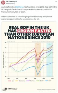
Here we have a tweet by HM Treasury that was raised as a concern with us. We actually found this to be a really good example of data in an infographic so lets explore why in more detail…
- This infographic has a clearly identified source labelled (IMF, World Economic Outlook, April 2023)
- There was clear context provided for the reductions in GDP (Covid)
- Where there were forecasts these were clearly highlighted in blue AND there was a clearly identified source labelled for the forecast (IMF forecast)
- The countries highlighted for comparison in this infographic were appropriate as they were comparable nations
The time period selected for this infographic was appropriate as 2010 was when the current Government came to power.
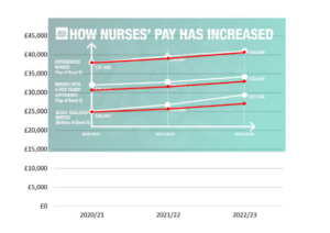
An infographic that could be improved

Turning to an example where we identified some areas for improvement, a tweet by DHSC that was raised as a concern with us. On this occasion we agreed that more could be done to improve the communication of these data. Lets explore why we thought that…
- This infographic has no identifiable source, meaning that it fails our first principle of intelligent transparency as you do not have access to the data. (Just in case you want it you can find it here for 2020/21, 2021/22 and 2022/23)
- The y axis on this infographic was not labelled and it also didn’t start at 0. This fails the government analysis function’s guidance on charts and also means it is lacking information that eases your understanding of the data, so that’s principle 2 of intelligent transparency missed too.
Last but by no means least on this infographic the lines appear to suggest a bigger relative increase in pay for newly qualified nurses than the data justify. When we responded to this concern we redrew the infographic to highlight this.
So why are we telling you this? Well we want to help anyone communicating data to portray their messaging in an accurate and trustworthy way that upholds our principles of intelligent transparency.
We often find that messages using data communicated in a clear, transparent way will be better received by the public. Rather than questioning the trustworthiness of the message presented, when the public are able to identify the source and context for the data, they are better able to take on the message being presented to them. Of course, we also want to reduce the opportunity for misinformation to be spread in the first place. If you are considering creating an infographic (or in fact communicating any statistics or data on social media) to communicate a message have a look here for our top tips.
So what about if you are a member of the public and you are concerned with an infographic or post you have seen on social media. We encourage you to be questioning of what you see. Guidance published by the House of Commons Library gives great advice on how to spot spin and inappropriate use of statistics. However, specifically for infographics what questions should you ask yourself?
- First things first, if you are ever concerned about statistics, look for the source and identify if the source data is showing what the infographic says it is. Often the source data will also provide more comprehensive context to explain what the data do and do not show, as well as any uncertainty in the statistics.
- If you have seen a post on social media, it is always a good idea to find out if what has been shared with you was actually what was shared originally. Sometime tweets or infographics are published in a thread giving you sources, caveats and context but this then gets lost if someone has copied and pasted the infographic, or just tweeted one tweet in a thread.
- The third thing to do if you remain concerned with the use of an infographic is to advise the department who is responsible for the data. They may be unaware that the data is being misused. You can also raise a concern with us at OSR where we will consider your concern in our casework function.