Quality: quality is about the data sources and methods used and communicating any limitations of them.
Tips for communicating the quality of statistics:
- Consider the context and complexity of the statistics. Is a dashboard the right product to convey the statistical messages? Or is there a risk of misuse?
- Be open about strengths and limitations.
- Use a layered approach:
- Critical caveats and quality warnings should be prominent and upfront.
- The use of accordions or drop-down boxes can help to communicate important context and definitions.
- More detailed quality information can be provided in supporting linked documents.
- Consider how you are communicating uncertainty. Maximise the use of visualisations and use concise and plain English language to describe any limitations.
- Collaborate and seek advice from data visualisation experts. Test with users and periodically review your approach to communicating quality based on that feedback.
- Make it clear if the statistics will be subject to revisions and update users when revisions are made.
- If any errors are identified, these should be corrected, and users should be notified accordingly.
Communicating quality
It is important that users are provided with key information about the quality of the statistics presented in the dashboard to support appropriate use and interpretation.
Visual space can be limited within dashboards, and so there is a balance to consider between the level of information that should be included upfront and not overwhelming the user. Because of this we have developed a three-layered communication framework that we encourage producers to adopt. Each layer is equally important, regardless of prominence.
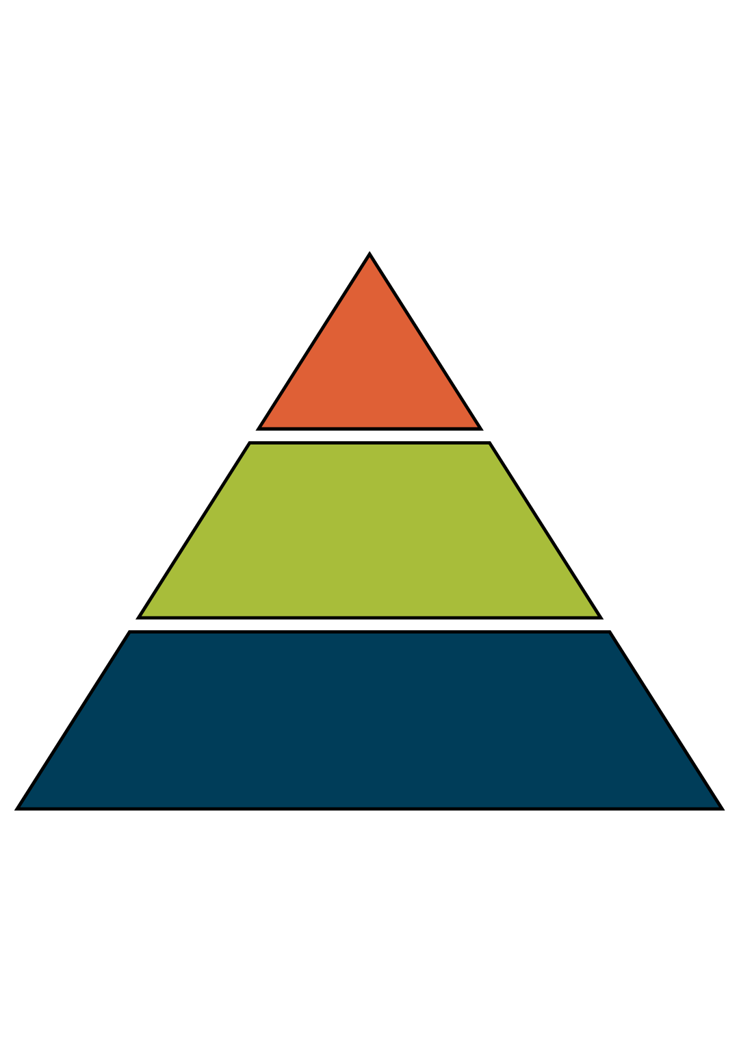
Most prominent: Brief critical data quality information, including any warnings
Prominent: More detail. Provides context, e.g. data definitions, impact of any revisions, limitations and associated uncertainty
Less prominent: Supporting quality and methodology notes. Can be provided in the dashboard as links to accompanying documents
Producers should outline clearly any limitations, caveats, potential revisions and quality issues with the statistics on the dashboard. Critical caveats and quality warnings should be prominent and upfront. Use concise and plain English language to maximise public understanding of any quality concerns and their impact on how they use the statistics. Caveats such as ‘use with caution’ are not helpful; more detail should be provided, so that users are aware of the exact issue and what that means for their use. For more complex statistics, where the visual space to communicate quality information and software choices are limited, a dashboard may not be the right product.
The Weekly Deaths dashboard developed by the Office for National Statistics (ONS) is a good example of a considered and layered approach that supports users to understand relevant quality information. A clear and prominent data warning that the statistics are provisional and subject to revisions is provided at the top of the dashboard. The note states that the figures are based on the date a death was registered, which is usually later than the date it occurred. A link to an additional user guide allows users to navigate to further information.
Throughout the dashboard, accordions (drop-down boxes) provide definitions and further explanations, such as ‘What are death registrations?’ and ‘What are expected deaths?’.
Most statistics are subject to a degree of uncertainty, which can affect statistical accuracy and meaning. Therefore, it’s important to ensure that they are communicated effectively, including when data are presented in a dashboard. Our published report, on the approaches to presenting uncertainty in the statistical system, can give some useful pointers on how to do this. Visuals and graphics should be used, where possible, to help communicate any uncertainty associated with the statistics.
The Government Data Quality Hub (DQHub) provides support for the Government Statistical Service and wider Analysis Function on communicating the quality of statistics, including uncertainty. This is centred around the guidance Communicating quality, uncertainty and change. There is also an uncertainty tool kit for analysts in government.
Managing revisions and errors
Dashboards can be a helpful product when timely statistics are needed. By design, dashboards can handle frequent and automated updates efficiently.
For some statistics, revisions are an integral part of the production cycle due to the availability of timelier data or the introduction of new and improved methodologies. It’s important to consider how revisions are communicated on a dashboard, particularly where estimates presented change status over time, for example from provisional to updated estimates.
It is important to update users on any identified errors and subsequent corrections. Where any errors are identified, a prominent note should be added to the dashboard, ideally on the initial interface, so that users are informed before interrogating the data at lower levels.
Back to top