
What we found
2.1 Current resources on uncertainty to support the Government Statistical Service
The Government Data Quality Hub (DQHub) provides support for the GSS and wider Analysis Function on the quality of statistics including uncertainty. This is centred around the guidance Communicating quality, uncertainty and change and an associated online course on the Office for National Statistics (ONS) Learning Hub (requires login). The latest version of the guidance was published in late 2018 and the DQHub intends to update this in the near future, taking onboard the insight from this and related work.
One of the goals in the GSS Quality Strategy and the related ONS Statistical Quality Improvement Strategy is that: “We will ensure our data are of sufficient quality and communicate the quality implications to users.”
The DQHub manages networks of ONS and GSS Quality Champions, sharing best practice. It ran a GSS sharing webinar on uncertainty (Youtube video) in June 2020, including contributions from analysts in government and from the Winton Centre. One of the presentations showcased the Uncertainty Toolkit for Analysts in Government which sits alongside the Aqua Book and gives a suggested set of guidelines when communicating uncertainty in analysis. The DQHub also provides advice and consultancy, for example collaborating on the guidance from the Race Disparity Audit on Which differences in ethnic group data are real?
In addition to the above, OSR produces guidance that draws out relevant areas from the Code of Practice in relation to Changes in statistical methods and also one that looks at where a change in data quality could mean a change in the National Statistics Status.
Other organisations have also looked at exploring ways of communicating uncertainty. For example:
- In 2020, the Winton Centre wrote about ‘The effects of communicating uncertainty on public trust in facts and numbers’, which explored and compared whether different ways of communication uncertainty made a difference to the public’s trust in the numbers.
- In 2021, FullFact, referencing this earlier work, produced a very useful review on presenting uncertainty including a list of key recommendations.
- ESCOE published research in 2021 concluding that the way that uncertainty information is communicated around productivity measures matters and that by being clear and directly communicating uncertainty was the best approach in setting the public’s expectations around future data revisions. ESCOE took this work further and looked at testing different visual representations of uncertainty with the public when comparing international estimates of productivity.
2.2 Uncertainty depicted in statistical bulletins (including visualisations), and methodological and quality documents
2.2.1 Overview
We have reviewed a range of statistics where we have found that producers have described uncertainty well in statistical bulletins. This includes incorporating both technical descriptions of uncertainty along with effective illustrations of where uncertainty lies. We also found that some producers went on to back this up by including links within the bulletin to more-technical methodological articles for those wanting to delve deeper. The best of these technical methods and quality documents would include comprehensive descriptions of the sources of bias and other errors, quantifying them where possible and helpful.
When we have intervened on inappropriate use of statistics, we found that there was sometimes a lack of supporting information covering limitations in the data, which failed to prevent inappropriate use. For example, we found cases where comparisons had been made over time or between countries where the data were not comparable.
Even though quantitative measures such as confidence intervals are sometimes published, they are sometimes presented in isolation without any supporting guidance or context. This can lead to the reported statistic being mistakenly interpreted by some users as the ‘true’ and only value, rather than an estimate that is likely to fall within a range of possibilities. It can be helpful to use terms such as ‘around’, ‘nearly’ or ‘about’ when presenting figures: these terms can help to inform the reader that the figures are not exact and therefore carry a level of uncertainty. This helps to avoid the risk of misleading users.
We also identified a wide use of rather loose statements concerning uncertainty such as ‘figures should be treated with caution’. While these caveats can play an important role in highlighting that limitations exist, in some cases these statements are not specific enough to be helpful and can be overused to the extent that they become lost. This lack of clarity about the limitations can result in either a misuse of a statistic or the opposite, where a user may decide erroneously that it is not safe to use a particular set of statistics at all due to insufficient information about the underlying quality. It is important for statisticians to understand how their statistics are being used and provide accessible information on quality to support their use.
We found that where producers had published information on the quality assurance processes and the risks associated with using administrative data, such as misreporting, users were more aware of how to use and correctly interpret the statistics. Another finding that we often mentioned in our work is that producers should make greater use of the Quality Assurance of Administrative Data (QAAD) framework as a tool to reassure users about the quality of the data sources. Without this, users can sometimes assume that administrative data will always be complete, which may not be true. For example, data will have been collected for a different and specific operational purpose where completeness of some data may have been less important or not possible, or may be incomplete at a point in time because of delays in updating the administrative system.
Uncertainty can also arise from survey data and can be driven by the survey sample size and its bias. For example, uncertainty can come from differential non-response or poor survey design. With administrative source data, bias can also be present in the resulting statistics. This might be through changes to the variables collected in the administrative dataset or decisions around the inclusion of records with missing data. A decision to omit these records from the analysis could introduce a bias in the statistics.
Our analysis identified a tendency to report information about statistical biases insufficiently clearly in statistical bulletins. Examples include not reporting on the level of non-response, coverage or whether self-reporting or reporting on behalf of someone else. These types of biases can be present in statistics based both on survey and administrative data sources.
There has also been an increase in the linking of datasets to create richer data sources. This is a positive development, but the linking of these datasets may introduce biases – for example, if linkage rates for a certain age group or ethnic group are higher than in other groups, then that group could be more represented in the analysis and could skew the results.
In more recent years, particularly in light of the pandemic, more use of modelling techniques has been made as producers try to address issues around reduced sample sizes or changes in mode of collection. Sometimes, the underlying assumptions in the modelling have not been made clear enough or described in an accessible way to allow users to fully understand the implications on the statistics.
When producers report on statistics that are subject to revision, the details are sometimes included only in the methodology reports and it is not always clear in the bulletins that figures are ‘reported’ incidents or events and therefore may be subject to a degree of regular revision. Related to this is the trade-off between what is often referred to as ‘rough and ready’ estimates that are produced at speed and usually with a higher degree of uncertainty and those statistics that are less timely but perhaps more certain. Communicating this distinction and the scale of any revisions is also important for users to know how they should be using the statistics.
The publication of infographics alongside statistical releases has been increasing in recent years and where they are done well, these can provide an easy and quick way to grasp the key messages including where these statistics can best be of use. In the best practice examples we found producers using infographics or introductory bullet points to set out clearly what the data can and can’t be used for. This includes, for example, highlighting where uncertainty associated with different breakdowns may affect the ability to use the data in a certain way especially where comparisons are being made. Specifics in this area included highlighting the increased uncertainty associated with disaggregated data for lower-level geographies. It is particularly useful when producers show this uncertainty in a graphical form.
Fan charts, such as those used by the Bank of England, are a helpful way to communicate inherent uncertainty. Other ways of demonstrating the range of possible values of a projection such as presenting variant projections are also helpful.
The Winton Centre also found that any graphical representation (error bars, fan charts, diffusion plots) of uncertainty around time series maintained trust in both the numbers and the producer of the statistics. We recognise that producers have taken steps to use newer approaches to data visualisation to try to overcome these challenges.
2.2.2 Case studies
Department for Environment, Food and Rural Affairs (DEFRA) England Biodiversity Indicators bulletin (Figure C6ib)
DEFRA, within its most recent publication looking at biodiversity, has shown clearly through the bulletin both in the narrative and illustratively that there is uncertainty in the estimates that they present.
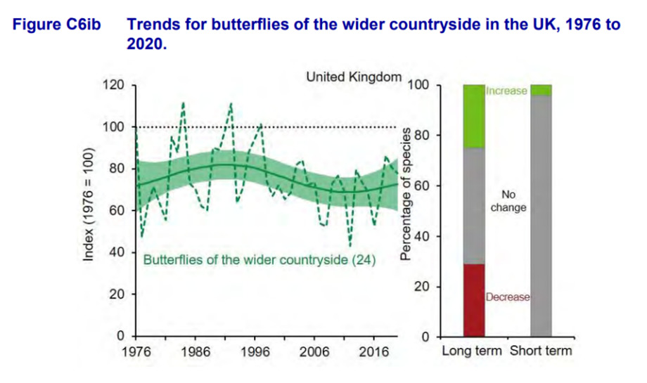
This image shows trends for butterflies of the wider countryside in the UK between 1976 and 2020. The line graph shows the unsmoothed trend (dashed line) and the smoothed trend following modelling (solid line) together with its 95% confidence interval (shaded). The figure in brackets shows the number of species included in the index. The bar chart also included shows the percentage of species within the indicator that have shown a statistically significant and those with no change.
Office for National Statistics: Covid ad-hoc analysis
In November 2020, we published our findings on some casework we received about an ONS ad-hoc analysis of the number of school workers, key workers and other professions in England who had Covid-19. We concluded that ONS had not intentionally presented the analysis in a misleading way but that there were some changes that could have been made to the analysis and the accompanying text to support those reading the bulletin in better understanding the results at that time. We thought that ONS could have done more to explain the uncertainty around these estimates particularly where they concerned education staff categories, and the ongoing implications of this uncertainty. In terms of particular phraseology and use of language, we highlighted that it could have been clearer that ‘no evidence of a difference’, as stated in the bulletin, is not the same as ‘evidence of no difference’. Following publication on this topic (February 2021) ONS addressed these points. In 2020, outputs from the survey were still in their early stages of development and we welcome the continual review and improvement that has been made to statistics produced from the Covid Infection Survey.
Welsh Government: Welsh Index of Multiple Deprivation
The Welsh Index of Multiple Deprivation (WIMD) statistics are widely used by central and local government and community organisations to target services. In addition to a really valuable set of outputs, during this review, we were particularly impressed with Welsh Government’s WIMD infographic depicting a complex product but clearly indicating how these statistics can be used and interpreted correctly by all users. The infographic clearly shows what WIMD can and can’t be used for in a very visual way.
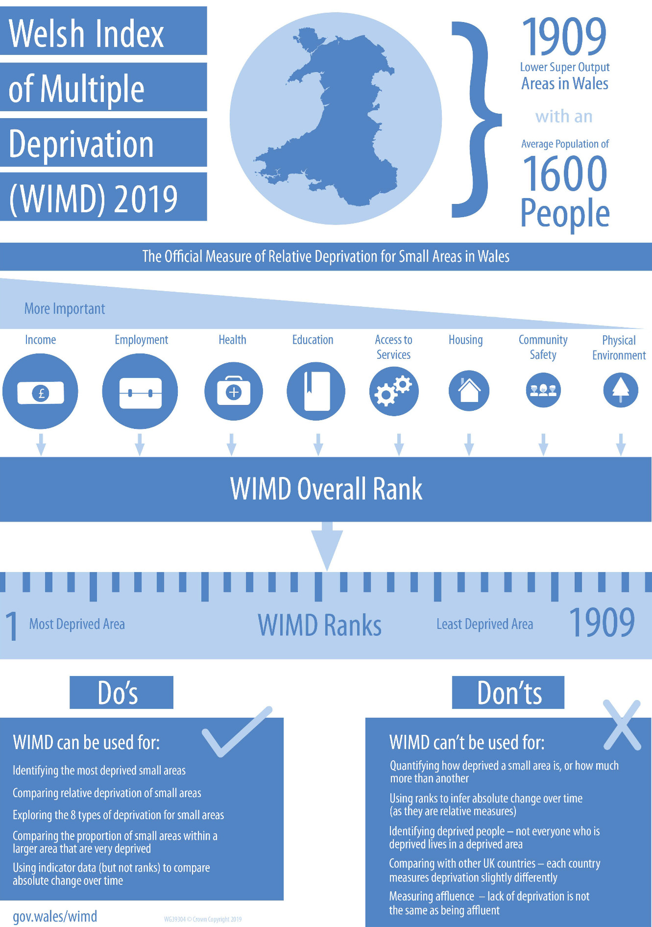
The WIMD 2019 guidance infographic shows what the Welsh Index of Multiple Deprivation is and how it should be used.
The Welsh Index of Multiple Deprivation (WIMD) 2019 is the official measure of deprivation for small areas in Wales. It identifies areas with the highest concentrations of several different types of deprivation.
There are 1909 Lower Super Output Areas (or small areas) in Wales, each with an average population of 1600 people.
There are eight types of deprivation (domains) included in WIMD 2019 and these are weighted in order of importance. Income is the most important determinant of deprivation, followed by Employment, Health, Education, Access to Services, Housing, Community Safety, and Physical Environment.
Each domain has at least one underlying indicator. There are 47 underlying indicators used in WIMD 2019. Ranks for the eight separate domains are created by combining relevant indicators within each domain. The WIMD overall ranks are created by combining the domain ranks.
WIMD ranks all small areas in Wales from 1 (most deprived) to 1,909 (least deprived).
Do’s – WIMD can be used for:
- Identifying the most deprived small areas
- Comparing relative deprivation of small areas
- Exploring the 8 types of deprivation for small areas
- Comparing the proportion of small areas within a larger area that are very deprived
- Using indicator data (but not ranks) to compare absolute change over time
Don’ts – WIMD can’t be used for:
- Quantifying how deprived a small area is, or how much more than another
- Using ranks to infer absolute change over time (as they are relative measures)
- Identifying deprived people – not everyone who is deprived lives in a deprived area
- Comparing with other UK countries – each country measures deprivation slightly differently
- Measuring affluence – lack of deprivation is not the same as being affluent
Office for National Statistics: Population Projections
ONS has developed a helpful way, as shown below, to present the effects of different underlying assumptions that could be fed into a projections model. This is a useful way to show that there is not only one projection but many alternative scenarios and also serves as a reminder that the sources and assumptions going into a model impact the output from that model.
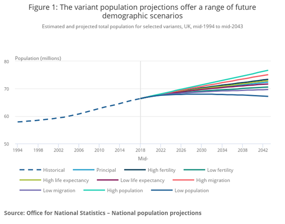
This image shows different population projections (known as variants) and how these compare with the principal projection. These variants will show a different trajectory over time depending on the underlying assumptions that are fed into the model. For the SVG image of this chart (accessible) and original data please see the Figure 1 on the ONS National population projections, variant projections: 2018-based.
2.3 Uncertainty depicted in data tables
2.3.1 Overview
Although statistical bulletins are still accessed and used by a wide range of users, statistics are increasingly being presented and consumed through tables, including detailed data tables charts, infographics. Opportunities are increasing for accessing individual and low-level data either publicly or through restricted-access channels, and these are particularly useful for further detailed analysis. There are specific challenges where users can compile their own data extracts through the use of table builders.
However, although many users are accessing data through tables and table builders, we found, in general, that the presentation of uncertainty in data tables was a particular weakness, even where uncertainty in the corresponding statistical bulletin had been presented well. Many data tables did not clarify that the statistics are estimates or reference uncertainty at all. In the case of projections, data tables were not always clear on what a central estimate was and that this does not necessarily equate to the most accurate point within the confidence band. Although this was a fairly recurring finding in our work, we recognise that it can be more challenging for producers to flag uncertainty while maintaining accessibility of the statistics. They are faced with increasing calls to limit the size of their outputs and publishing estimates that are clear and easy to find without the inclusion of lots of footnotes and caveats is difficult.
Where statistics producers are doing this well, it is through presenting high-level information on uncertainty and appropriate use at the forefront which includes in data tables.
Another issue can be that despite the inclusion of confidence intervals (CIs) in the data tables, users can be left unsure of how they should interpret the estimates and CIs if some high-level guidance is not included alongside.
2.3.2 Case studies
Welsh Government: Motoring Offences Statistics
These data tables are published by Welsh Government and show figures for various driving offences. For example, breath test statistics are used to measure the effectiveness of drink–drive campaigns by police forces.
Although the main statistical release published alongside the data tables is clear that the figures are estimates, there is no mention of uncertainty in the data tables (nor in the statistical quality tab associated with the data tables).
Office for National Statistics: Annual Survey of Hours and Earnings (ASHE)
The Annual Survey of Hours and Earnings (ASHE) tables contain estimates of earnings for employees by sex and full-time or part-time status. An example of one of these tables for gross median pay for part-time employees is linked below. ASHE is based on a 1% sample of jobs taken from HM Revenue and Customs’ Pay As You Earn (PAYE) records.
The colour coding within the tables indicates the quality of each estimate based on the coefficient of variation (CV) of that estimate. The CV is the ratio of the standard error of an estimate to the estimate itself and is expressed as a percentage. The smaller the coefficient of variation the greater the accuracy of the estimate. Estimates with a CV greater than 20% are suppressed from publication on quality grounds in addition to those that present a disclosure risk.
This example of indicating differences in quality in a table by the use of colour coding is a good idea, it is both simple and effective and well explained. The downside is that, as with all attempts to demarcate with cut-offs, it can be quite a crude measure and doesn’t take into account the uses to which the data might be put, and the level of accuracy that a user might need. There are also questions about ensuring that such an approach would meet website accessibility criteria.
In the Earnings and hours worked, region by occupation by two-digit SOC: ASHE Table 3, Table 3.7a Gross Annual pay for part-time employee jobs in the UK, 2021 shows the gross annual pay within each percentile. The colour coding depicts a range within which lies the coefficient of variation giving an indication of how reliable the estimate is.
Department for Education: Key stage 2 statistics
In the 2019 Key Stage 2 statistics published by Department for Education, we found that although the tables presented included confidence intervals for the progress scores, there was no context provided and no explanation given about the confidence intervals or how to interpret them. It is positive that the confidence intervals are shown but the inclusion of more context could help users to better interpret what these intervals mean especially where they might be making comparisons.
Office for National Statistics: Low Carbon and Renewable Energy Economy statistics
ONS publishes Low Carbon and Renewable Energy Economy statistics that include a bulletin and data tables. Within each data table, the level of uncertainty associated with the figures is presented as a coefficient of variation (CV), a measure of the relative variability of the data. This gives an indication of some aspects of the uncertainty in the estimates and can aid in the interpretation of the statistics as the estimates and the associated uncertainty are presented together in the data tables where many users will access the raw figures. However, although it is really positive to see an example of where a measure of uncertainty is reported together with the estimates in the data tables, its interpretation is unlikely to be accessible to users who may not be so technical and it avoids reporting on other biases that could be present.