During the coronavirus pandemic a key question has been: How many people have died because of COVID-19? This seemingly straightforward question is surprisingly difficult to answer.
The complexity lies partly in the different ways this can be measured. Is it about how many people died because of a COVID-19 infection? Or, how many more deaths there have been because of the pandemic, whether a direct or indirect result of COVID-19 (‘excess deaths’)?
Even when the question is clear, the variety of data published by different organisations can mean it is hard to know what the right answer is. The official published data cover varying sources, definitions and methodologies. Factors leading to differences in published death figures are set out but the amount each factor contributes to the differences does not appear to be fully understood and needs to be more clearly explained.
Each of the sources support different purposes. Greater clarity on these purposes would support a better understanding of the data and improve confidence in the estimates produced by government.
What data are available?
The Office for National Statistics (ONS) has published a summary of data sources available across the UK. This provides a good summary of the range of data available and Section 7 sets out useful table showing how the sources differ. However, the article does not make any judgement on the impact of these differences or the best source of data to use in specific circumstances.
Estimates of ‘excess deaths’ are the difference between the number of deaths we would expect to have observed at this time of year and the number of deaths we have seen. This is generally considered to be the best way to estimate the impact of a pandemic on the death rate. ONS and Public Health England (PHE) have published estimates. The most recent ONS publication has been clearly explained and provides comparisons across 29 countries, with information published at UK, country and local authority levels. The methodology published alongside the PHE report explains how PHE draw on data from ONS to produce its estimates.
There are estimates for the number of people who have died as result of a COVID-19 infection, a really important factor in understanding COVID-19 and the development of the pandemic. For England, there are three main sources of COVID-19 daily deaths data. These are:
- Office for National Statistics (ONS) Weekly deaths: The provisional count is published weekly, 11 days after the end of the time period it covers. Figures are drawn directly from the system of death registration and include all deaths where COVID-19 is mentioned on the death certificate. These figures cover all settings and include a breakdown by setting. Counts are published for date of death and date of registration.
- Public Health England (PHE) Surveillance data: Published daily, these estimates cover deaths in all settings, by date of reporting or date of death, for any individual with a positive COVID-19 test result. There is currently no cut off for the date of the positive test relative to the date of death.
- NHS England (NHSE) Hospital deaths: Published daily, these figures cover hospital deaths with a COVID-19 positive test. Since 24 April figures are also published for instances where COVID-19 is referenced on the death certificate, but no positive COVID-19 test result was received. Since 19 June, if a death occurs more than 28 days after a positive test then it is not be included in the headline series (though would still appear in the figures for COVID-19 mentions on a death certificate with no positive COVID result).
In all three sources, the organisations make information available on when deaths have been reported or registered as well as the date the death occurred. The data from these three sources relating to date of death is considered through the rest of this blog as this is the most informative headline measure and the measure which is more directly comparable between the three sources. The date on which a death is reported or registered can vary for a number of reasons, generally linked to administrative processes, and therefore leads to a more volatile series. While this registration information has value, the uses and limitations of these data should be clearer. The date of death should be used as the headline measure for understanding when deaths occurred.
How much do the sources vary?
There are valid reasons for differences in the figures for number of COVID-19 deaths published from each of the three sources outlined above. Each source is published in order to meet a different purpose and therefore has value in its own right. However, the purpose of each source and what it seeks to measure is not always clear. For example, more timely data from PHE offers a leading indicator of the current development of the pandemic, while the ONS counts offer a more reliable indicator in a slightly slower timeframe.
While differences will always occur, it is really important that the reason for these differences is understood and well explained. This assures those using the data that they are using the most robust data for their purpose that in turn supports better informed decisions. The triangulation of data between sources can offer an important part of quality assurance and may support methodological improvements over time.
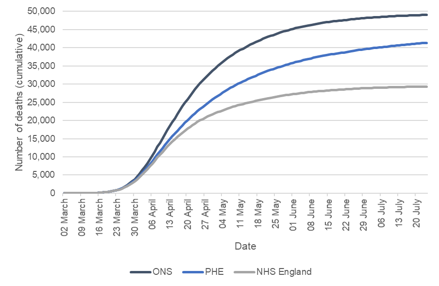
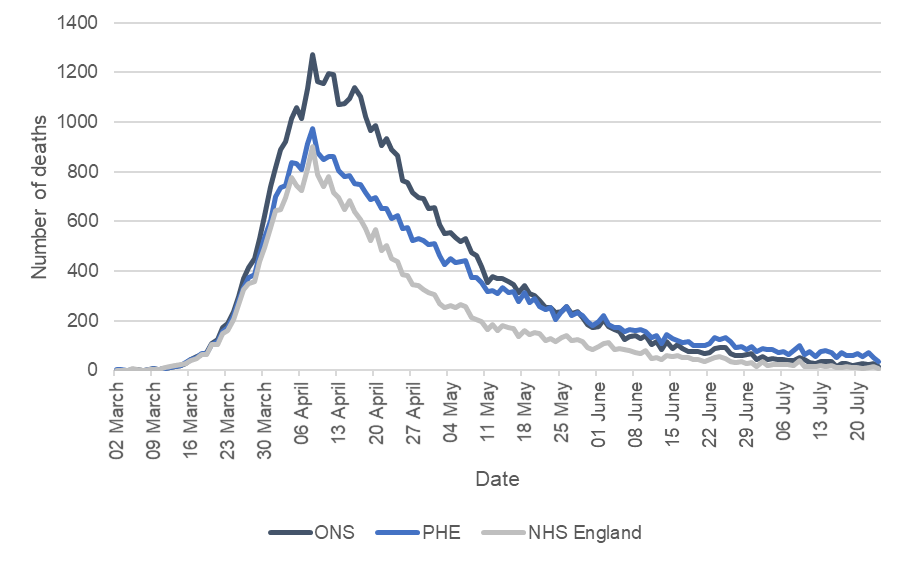
When looking at the data based on date of death for all three sources, the trends are broadly consistent over the period of the coronavirus pandemic. The charts below show the data for date of death from the three sources for England, up to 24 July 2020.
Figure 1: Cumulative deaths by date of death up to 24 July 2020
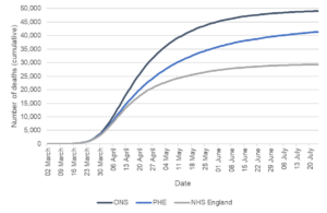
Sources: ONS Weekly Deaths COVID-19 – England Comparisons (NHSE deaths published by 2 August and ONS deaths registered by 1 August) and PHE England Deaths by Date of Death (5 August download).
Figure 2: Deaths by date of death up to 24 July 2020
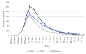
Sources: ONS Weekly Deaths COVID-19 – England Comparisons (NHSE deaths published by 2 August and ONS deaths registered by 1 August) and PHE England Deaths by Date of Death (5 August download).
While the overall trends shown by the data follow a similar trajectory, it is notable that the relative positions of the trend lines change. For much of the pandemic the ONS daily estimates of deaths have been higher than the PHE daily estimates. Since the last week of May, the PHE daily estimates are generally higher than the ONS estimates for the equivalent dates.
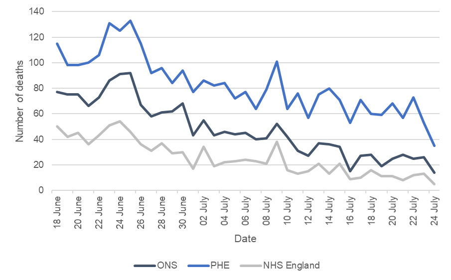
More recent data shows greater volatility, as expected given the lower numbers of deaths observed. Relatively small differences (in numerical terms) have a greater impact on percentage differences. Figure 3 illustrates the difference between PHE and ONS figures over the most recent month for which both data are available. The gap between the two sources in numerical terms is volatile, but broadly consistent over this period. However, because of the reducing number of deaths, the percentage difference is increasing (though variable) over time. It is likely the ONS provisional counts will be revised up over time, but this is unlikely to close the observed gap fully.
Figure 3: Deaths by Date of Death 18 June 2020 to 24 July 2020
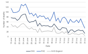
Sources: ONS Weekly Deaths COVID-19 – England Comparisons (NHSE deaths published by 2 August and ONS deaths registered by 1 August) and PHE England Deaths by Date of Death (5 August download).
Another way to corroborate the data between sources is to consider the NHSE data compared to the ONS data on place of occurrence (e.g. hospital, care home etc). ONS publishes data on place of occurrence by date of death in the local authority tables, including COVID-19 breakdowns. The trends look broadly consistent (see Figure 4). The overall number of deaths recorded in hospitals is similar for both sources By 24 July ONS reported a total of 31,022 deaths in hospitals and NHSE figures showed 29,303 deaths in hospitals (reported by 2 August) for those with a positive test, a difference of five per cent. If the NHSE figures for those with COVID-19 mentioned on the death certificate but no positive test are also included, then the cumulative totals from the two sources are even closer.
Figure 4: Hospital deaths by date of death (week end date)
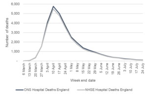
Sources: NHSE data from ONS Weekly Deaths COVID-19 – England Comparisons (published 2 August) and ONS Death Registrations by Local Authority (4 August).
Why does this variation occur?
There are many possible explanations for the observed differences and some estimates of the scale of impact has been made, but it is not yet clear what the dominant factor is. Some of the issues that contribute to differences are outlined below. Producers of these statistics could seek to better explain the impact of the differences and support a clearer overall narrative.
Positive tests compared with death registrations
The most significant difference in published figures is likely to relate to whether the data are based on positive COVID-19 tests or information on death certificates. ONS data are based on information from death certificates and include cases where COVID-19 is likely to have contributed to death (either confirmed or suspected) in the opinion of the certifying doctor. PHE data covers all deaths where the individual has had a positive COVID-19 test at some point in the past. NHSE data covers cases with positive test results (since 19 June the positive test result must have been in the 28 days prior to the death) and since April also separately publish information on death certificate mentions of COVID-19 with no positive test result.
The impact of these differences in approach is unclear. For example, PHE data will include some cases where an individual had a positive test result, but the death was not because of COVID-19. There will also be cases where a death is due to COVID-19, but no test had been conducted – these cases would not appear in the PHE data. It is likely the balance of these two factors has changed over the course of the pandemic, as testing has become more widespread. For the earlier time periods, PHE’s approach may have underestimated the number of deaths from COVID-19 (primarily because lower numbers were tested). More recently, PHE data may be overestimating deaths from COVID-19 because the approach is picking up more people who had died from other causes, but had tested positive for COVID-19 at some stage (either because the COVID-19 was mild and not the cause of death or because the individual had recovered from COVID-19 before the death occurred).
Comparison of ONS and PHE data at the level of individuals should help understand the impact of this issue. However, early in the pandemic it is also possible that measurement based on death certificates underestimated COVID-19 related deaths, possibly because of a more limited awareness of the virus at that stage and the impact of this is likely to remain hard to measure.
Positive test cut offs and death registration time lags
Timing differences will impact on the estimates.
NHSE have introduced a 28-day cut off between positive tests and date of death. This is an approach also taken in some other countries. However, the impact of this cut off and whether it is appropriate is currently unclear. It is likely that introducing a cut off for the PHE data would reduce the estimates a little but would not bring them down to the level of the ONS estimates. PHE’s work to look at the validity and implications of a cut off of different lengths is really important. The impact of having a cut off or not will become more marked in later stages of the pandemic, for example, because as more time passes, the likelihood of death occurring for individuals who were tested more than 28 days earlier is increasing.
ONS data are based on COVID-19 being mentioned on the death certificate (suspected or confirmed). This approach has many strengths. However, the provisional figures first published will not capture all deaths due to registration delays. ONS is clear about this limitation and publishes details of the impact of registration delays on mortality statistics. However, there is not currently an assessment specific to COVID-19 and given the unprecedented circumstances it is hard to predict the scale of this issue based on past revisions. For example, the impact of deaths which have been referred to a coroner is currently unknown and could lead to an undercount as those deaths may not be formally registered at this stage. In general, most of the impact of revisions is seen in the first few weeks after initial publication.
Methods of compilation
Each of the organisations get data from different sources and have different approaches to production of the estimates. The impact of these differences is not well explained.
NHS England data are based on deaths which occur in hospital. They form one input into the PHE data. It would be expected that the NHSE data as a proportion of PHE data would be broadly similar to the proportion of hospital deaths seen in ONS data. This is not currently the case. While some of this could be down to definitions (for example use of the 28-day cut off by NHSE) it is likely that there are other factors contributing to this difference. NHSE data are taken from submitted hospital returns and rely on the hospital matching a positive test with a patient. PHE data are drawn from multiple sources which need to be cleaned and matched to deliver PHE estimates of deaths. This is a complex process. It is possible that through this process some hospital deaths are picked up by PHE which have not been included in the NHSE data, but there may be other unknown factors contributing. Further work to understand what drives the differences between the two sources would give greater confidence in the data.
What needs to change?
It is positive to see that organisations are trying to better understand the issues associated with these data and why these differences occur. The analysis ONS and PHE are undertaking to look at differences between sources should offer a valuable insight into what is driving the differences and whether there are any changes needed in the production or interpretation of any of these statistics.
It is critical that there is greater transparency about how estimates are produced and what is driving the different numbers being published. Statisticians across relevant bodies must take a lead in understanding these data and communicating weaknesses, limitations and a coherent narrative. This will improve confidence in the data and decisions made based on these data.