Data query tools and visualisation are increasingly supplementing the traditionally produced statistics publications to provide users with a more engaging way to access the statistics. For some, the pdf report is a thing of the past as producers move to publish statistics and supporting commentary in html format, giving improved user accessibility and enabling producers to carry out web analytics to understand user journeys. For others, separate outputs which highlight the key messages from the statistics are published in addition to the fuller statistical report with its insightful commentary.
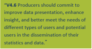
The innovation and improvement principle in the Value pillar of the Code includes practice V4.6 which covers innovation in the dissemination of statistics. Looking across the Value pillar there are other practices which are also relevant in this area (such as practice V1.6 and practice V3.2). There is a clear steer from the Code to explore and develop statistical outputs in new and engaging ways.
Innovations in disseminating Children, Education and Skills statistics
We heard from various producers during our review of innovation about work that they had been undertaking to develop alternative outputs to supplement their main statistical publications. The aim of this article isn’t to comment on the specifics of the data tools or visualisations themselves (though we would encourage you to take a look) but instead to highlight some of the positive features of the development process which particularly stood out to us, and which we think producers of statistics can learn from.
1. Identify the need and be clear on what you want to achieve
In the excitement of innovation, producers should not lose sight of user need. Innovation shouldn’t be for innovation’s sake. Investing resources in innovation in the presentation of the statistics should be considered alongside the range of users and uses of the statistics; understanding their – quite possibly – varied needs when it comes to accessing, interacting with, and analysing that information.
Ask yourself why you are undertaking this work, are you clear on what you want to achieve and why? You are about to invest time and money into developing a solution – do you have evidence that this is what users need?
In some cases, there may be a ministerial commitment to improve the way statistics are presented, or producers may receive high volumes of ad hoc queries about the statistics, or you may have feedback from a more structured and comprehensive review of user needs. Understand who uses your statistics and why – what are the questions they want answered. For example, data visualisations are often very helpful for users with limited experience of the data who want to see key messages easily, data exploration tools support those looking for more detail whilst downloadable underlying data files enable experts to do their own analysis. Resources from the Good Practice team will help you think about identifying and engaging with your users.
User need should drive the development, not just at the outset of the work but throughout the process. Once you decide you have evidence to initiate work and you begin to explore solutions, test these with users and listen to their views. Keep users need at the heart of the work.
Case Study: Ofqual
During 2017, Ofqual under took a statistics transformation programme to make their statistics more engaging, informative and targeted to different types of users. They used ONS’ user personas to think about different types of users. As part of this, they identified that their A Level and GCSE results data have a wide, interested user base but that their data would be much more useful to users if it were able to personalise the data they were looking at – for example to focus on data about education centres of a similar size to theirs. They also faced a new challenge of how to present data on the distribution of GCSE results for courses that had moved from A*- G grading to 9-1 to help teachers, pupils and the public understand the new system. They developed some interactive visualisations using R to present GCSE and A level results, which they tested with users and refined following feedback. To inform future developments they set up google analytics to monitor how users were interacting with their content.
2. Think about your timing
Data visualisations or data query tools can be published alongside the main statistical report or at later date as a way of providing users with access to more up to date data or additional insight and analysis. The package, content, and timing of outputs will depend on factors such as:
- the availability of the data – it may be most relevant to provide users with an annual statistical report to provide appropriate interpretation of trends however data may be available more regularly, on a monthly or quarterly basis, which can be released without a full commentary
- user needs for information – the statistics may be used by different users at different times, some users may only be interested in bigger picture information while others may want to monitor changes in the system at a more frequent and detailed level
- appropriate interpretation – for example if statistics and data are being provided at intervals outside the main reporting schedule, what trend information is most appropriate to provide for users, what conclusions can be drawn from this information and what do users need to know about the strengths and limitations of this source?
Whatever you decide, be clear to your users what will be available and when.
3. Tell an engaging story
Statistics add value when they are presented clearly, explained meaningfully and provide authoritative insights that serve the public good. These insights can be provided through commentary that explains the relevance, meaning, and appropriate use of the statistics and illustrated by suitable data visualisations. Data visualisation can provide users with an interactive presentation of statistical information and can help to tell an engaging story. However, integrating visualisation into statistical outputs should be done in a considered manner – by thinking about what messages from the statistics would be beneficial to expand on or illustrate using visualisations, what contextual information users will need, and how you ensure the visualisations are accurate and do not present a misleading picture for users.
Use of data tools or dashboards can also be a way of pulling together relevant statistics to give users a more complete picture of a topic. Statistics on a topic, which may span a number of different statistical publications, may be published throughout the year at different times depending on factors such as the data sources used. These individual statistics all provide information which, when pulled together, can offer users a more comprehensive overview of a topic, and in doing so can help users answer their questions using a range of evidence sources. Creating a compendium like this of course could be achieved using different formats however considering an interactive solution can be useful where users might be particularly interested in filtering on subgroups or areas of interest.
Case Study: Scottish Government Schools dashboard
Analysts in the Education team in Scottish Government have been developing dashboards to enable users to explore school level data. The Achievement of Curriculum for Excellence Levels dashboard, produced in Tableau, enables teachers, parents and others interested in education to see how children in a given school are achieving at various stages. The design and accompanying text support appropriate use of this experimental dataset. For example, due to ongoing improvements in data quality year-on-year comparisons are not yet robust, and therefore are not made available to users. The team are also bringing together wider information about schools, such as pupil characteristics, pupil teacher ratios, and absence data into one dashboard, which will hopefully be released later in the year.
4. Tap into individuals’ experience and enthusiasm, and be prepared to train
Producing new statistical outputs will often require producers to review the skill set within their teams or department and consider training opportunities for current staff. Producers should understand the skills profile of their teams as well as the skills across the organisation. For example, while the statistician may not be trained in a certain programming language, individuals in the IT team may have these skills, and may be able to support the development of new outputs.
Where an individual identifies a desire to gain new skills, meeting those training needs can bring a variety of different benefits. An enthusiastic newly trained staff member can be a driver to explore or support development work more generally, particularly if they are given an opportunity to implement their new skills in the workplace. They can act as a champion within your department and as someone who can share their learning and upskill others.
Case Study: Department for Education
At the Department for Education, analysts have been thinking about different ways to present data to meet user needs. The lead of the Further Education Statistical Dissemination Team was inspired to use his technical skills to present high profile apprenticeship data in new ways. He investigated a variety of visualisation tools, using online resources to develop his skills, leading to the production of experimental data visualisation of apprenticeships data developed in D3 and google charts. In addition, he also provided data in pivot tables to enable users an alternative way to explore low-level data. This work has helped to raise awareness in DfE about what can be achieved with data visualisations and is feeding into a wider departmental strategy on putting out data in ways that truly meet user’s needs.
5. Share your learning
Unsurprisingly, we spoke with lots of producers who were trying to achieve similar goals and facing similar challenges. Some were engaging with other departments or teams to help support them in their development and in some cases producers were tapping into expert developer forums to get support on technical matters. However, it seems to us even better use could be made of networks and lessons learned could be shared more widely. The Government Statistical Service Presentation and Dissemination Committee (PDC) is a great way to share what you are doing and get advice and support from others. Get to know your PDC champion, ensure they are aware of the work you are doing, and share your experience with others. For more ideas on how to get the most out of working with others, read our previous piece on collaboration.
Over to you
If you think presenting your statistics in new ways could be beneficial to your users – whether it’s to help their understanding of the key messages, their ability to access underlying data or so they can see how the statistics fit into the bigger picture – get talking to them. Our next post will explore some of the challenges you might face along the way.