Communicating data is more than just presenting the numbers

There has been a lot of talk about a UK Health Security Agency (UKHSA) technical report. It includes information on COVID-19 case rates in England for vaccinated and unvaccinated groups (Table 5). For some the immediate reaction to these data has been outright disbelief, others have used the data to support pre-existing, and incorrect, views that vaccines are not effective. Neither of these reactions is right. Understanding the issues properly is extremely complex, but what we do know with some certainty, is that while the vaccine will not stop the spread of the virus completely, it has been shown to help improve outcomes.

We have seen considerable improvements to the presentation of the data in the latest UKHSA report, which should support better interpretation of these data in future. However, it provides an important lesson about the harm that can be done if data are not clearly presented and well explained. There is more to communicating data than just presenting the numbers. Producers of data should do everything they can to minimise the potential for misinterpretation or misuse.

As well as presenting data clearly, producers need to guide users on how the data they publish can, and perhaps most importantly cannot, be used. They also need to explain the choices that are made in producing the analysis, along with the implications of these choices. Producers of data are the experts in the data they publish, their insight and understanding of these data can help ensure its appropriate interpretation and use.

To return to the example of COVID-19 case rates by vaccination status, the choices made by UKHSA have been a source of much debate because the consequences of the choices are so significant. It is important these choices and their implications are explained, and it is perhaps even more important that the guidance on interpretation of the data is clear. As an organisation of experts, UKHSA is in a position to help the public understand what the data mean, including explaining why the findings may not be as counter intuitive as they first appear while leaving no uncertainty around its views that vaccines are effective. UKHSA can help explain where there is value in using the data (e.g. looking at changes in case rates over time or across age bands, within the vaccinated group) and where there is not (e.g. understanding vaccine effectiveness).

Guidance on interpretation

The report is clear that a direct comparison of rates for vaccinated and unvaccinated is not appropriate. The report opens with the text:

These raw data should not be used to estimate vaccine effectiveness as the data does not take into account inherent biases present such as differences in risk, behaviour and testing in the vaccinated and unvaccinated populations.”

This is a helpful health warning. By thinking about questions people may have and how they may try to use data, producers can pre-empt potential issues and provide explanation that will support appropriate interpretation. In the context of COVID-19 case rates some of the key questions might be:

  • What are the data measuring? And is this what people want to know about? Many people want to know the risk of COVID-19 infection for those who are double vaccinated compared with those who have not had a vaccine. The data in UKHSA’s Table 5 do not do this. It does not show infection rates in the population. The table shows case rates i.e. the rate of COVID-19 positive tests in those who come forward for testing, something the government continues to ask people to do[1]. As a result, the data may have inherent biases.
  • Are the two groups in question comparable? It is easy to see that there may be different behaviours in people who have had two vaccinations compared to those who have had none. One hypothesis is that those with two vaccinations are more likely to get tested, meaning the case rates will look relatively higher for this group compared to the unvaccinated group. There will also be different risks associated with each group, the vaccination programme prioritised vulnerable groups and frontline health and social care workers, so includes those who are more at risk of infection. We haven’t seen evidence to quantify the impact of these risks and behaviours, but it’s likely there will be an impact.
  • Are there other sources of data which could be considered? There are increasingly other sources of information which demonstrate vaccines are highly effective. The UKHSA has done a significant amount of research and analysis into vaccines. This is outlined in the vaccine surveillance report, which sets out effectiveness against different outcomes (infection, symptomatic disease, hospitalisation and mortality). There is further information via UKHSA’s monitoring of the effectiveness of COVID-19 vaccination In addition, the Office for National Statistics (ONS) has published an article on the impact of vaccination on testing positive as well as an article on deaths involving COVID-19 by vaccination status. All of these examples take into account characteristics of those in the sample and try to adjust for differences. As a result, they offer a better indication of vaccine effectiveness.

Implications of choices

To undertake any analysis choices need to be made. These choices and their implications should be explained.

In the calculation of COVID-19 case rates the most significant choice is the decision on what population estimates to use to calculate the rates (“the denominator”). There are two obvious choices: the National Immunisation Management Service (NIMS) or the ONS mid-year population estimates. Each source has its strengths and limitations and we don’t yet know the true figure for the denominator.

In the context of case rates the choice of denominator becomes even more significant than when it is used for take up rates, because the numbers of people with no vaccine are low. The population of people vaccinated is relatively well known, NIMS includes all those who have been vaccinated and is a good estimate of this population.

The difficulty comes in understanding the total number of the population who have not had a vaccination. There are many advantages to using NIMS, not least because it is consistent with international approaches to considering immunisations and allows for analysis which would not be possible using aggregate population estimates. However, we also know that NIMS overestimates the population. Similarly, there are strengths in using ONS mid-year estimates, but we know these can have particular difficulties for small geographic breakdowns. We also know that the time lag created by using mid-year 2020 estimates has a disproportionate impact in older age groups – for example, it means that in more granular age bands some older age groups show more people having been vaccinated than the ONS population suggests exist. There is more information on the strengths and weaknesses of each source in NHSE&I’s notes on denominators for COVID-19 vaccination statistics. The chief statistician at Welsh Government has published a blog which outlines the impact of the different choices for vaccine uptake in Wales.

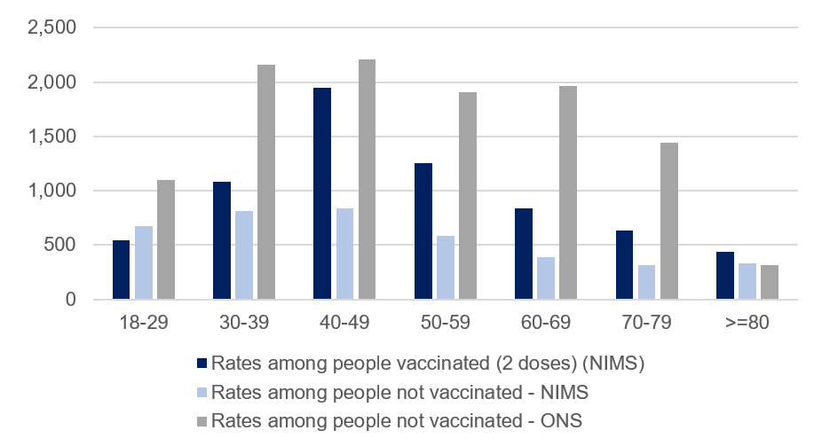
Looking just at the adult population, Figure 1 shows the different results which come from using the two different denominator options for the population who have never had a COVID-19 vaccine.


Figure 1: COVID-19 case rates per 100,000, England by age band

This table shows covid 19 case rates per 100,000 people in England by different age groups

*see notes at end for the data and more details of sources used in this figure.

Using the NIMS denominator, the positive case rates for those who are not vaccinated is below the case rate for those who are vaccinated (except in the 18-29 age band). Using the ONS mid-year 2020 estimates as a denominator, the positive case rates for those who are not vaccinated is higher than for those who are vaccinated (in all age groups below 80). While we don’t yet know the true figure for the unvaccinated population, this seemingly simple choice has a huge impact. It is particularly problematic in this circumstance because any error in the total population estimate is applied in its entirety to the unvaccinated population.

As an example, for the 70 to 79 population, the NIMS figure is just 4% higher than the ONS mid-year estimates (5.02 million and 4.82 million respectively). These figures can then be used in combination with the data on total people vaccinated from NIMS to estimate the total number of people not vaccinated. In doing this, the difference of nearly 200,000 in the total population estimates is applied entirely to the relatively small number of 70 to 79 year olds who are not vaccinated. It means the NIMS estimate for the unvaccinated population in the 70 to 79 age band is 363% higher than the estimate of those not vaccinated based on the ONS mid-year estimates. So, an estimate 4% higher at the 70 to 79 age band has led to an estimate 363% higher in the estimate of the unvaccinated population at that age band. This has a huge impact on the case rates for this group, and the conclusions drawn from the data.

An understanding of the impact of choices is essential in supporting appropriate interpretation of the data. In this scenario, we don’t have enough information to know the true figure for the unvaccinated population in each age group. We hope that the work UKHSA is doing to improve the NIMS data (including removing duplicates) along with the work ONS is doing on population estimates and the 2021 Census, will improve our understanding. It is really positive that ONS and UKHSA are working together to try and solve this issue, which is so important across so many statistics. Given this uncertainty, knowledge of the implications of the different choices can help users interpret the presented data with caution.

The message from all this is that data has huge value, but it is also really important that those publishing data consider how the data may be used, what the strengths and limitations of the data are and think about how to present data in a way that minimises the potential for misuse.

In time, there will be changes to what we know about the population, and producers of analysis should not shy away from updating their outputs when new evidence comes to light. In doing this, they should also clearly explain any changes and choices, as this transparency will support trust and understanding. It will help the good data shine out and ensure statistics serve the public good.

[1] https://www.nhs.uk/conditions/coronavirus-covid-19/testing/get-tested-for-coronavirus/


Data, sources and notes for case rate calculations:

Table 1: COVID-19 case rates per 100,000, England by age band

Age bandRates among people vaccinated (2 doses) (NIMS)Rates among people not vaccinated - NIMSRates among people not vaccinated - ONS
18-29546.0671.31089.9
30-391084.3816.52159.1
40-491945.2834.02207.1
50-591252.1585.51907.2
60-69837.6390.71964.7
70-79636.1311.81443.7
80 or over434.1334.1312.1
  1. The calculations in Figure 1 and Table 1 are based on publicly available data. There are slight variations compared to the UKHSA data in Tables 2 and 5. For example, it is not clear exactly what date UKHSA has used for total vaccinated or unvaccinated populations, and there are regular revisions to the published data on the coronavirus dashboard, which may have caused changes since data were used in the UKHSA analysis. These differences are not big enough to impact on the conclusions in this blog.


  1. NIMS data from coronavirus dashboard download, downloaded 31 October 2021. Metrics downloaded: “vaccinationsAgeDemographics”. Variables used:
  • Total population = VaccineRegisterPopulationByVaccinationDate (for 24 October)
  • Total vaccinated population = cumPeopleVaccinatedSecondDoseByVaccinationDate (for 10 October i.e. 14 days before end of period, as only cases with vaccination 14 days or more before positive test are included in UKHSA table of cases)
  • Total not vaccinated = Population estimate – cumPeopleVaccinatedFirstDoseByVaccinationDate


  1. Total number of cases by age, and, cases by vaccination status by age, taken from COVID-19 Vaccine surveillance report week 43. UKHSA report shows total cases for four weeks to 24 October 930,013. Data downloaded (31 October) from coronavirus dashboard for four weeks up to 24 October (inclusive) gives 935,386. Additional cases likely due to cases reported between UKHSA analysis and 31 October.


  1. ONS population estimates based on ONS 2020 mid-year estimates taken from NHSE&I weekly vaccine statistics, 28 October 2021 (downloaded 31 October).

Transparency: How open communication helps statistics serve the public good

Over the past 18 months we’ve talked a lot about transparency. We’ve made public interventions such as our call for UK governments to provide more transparency around COVID data, and it’s been prominent in our vision for the future of analysis in government, including in our Statistical Leadership and State of Statistical System reports.

But what do we mean when we talk about transparency? Why do we care? And what can be done to support it?

What do we mean by transparency?

Transparency is about working in an open way. For us, transparency means being open about the data being used. Explaining what judgements have been made about data and methods, and why. Being clear about the strengths and limitations of data – including what they can tell us about the world, and what they can’t. It also means making sure data and associated explanations are easy to find and clearly presented. It is at the core of many of the practices outlined in the Code of Practice for Statistics.

Why does it matter?

The pandemic has increased the public appetite for data and drawn attention to the significance of data in decision making. Many of us will have become familiar with the phrase “data, not dates” – a phrase which UK government used as it set out its road map for easing coronavirus restrictions. In a context when so many have been asked to give up so much on the basis of data it is especially important that the data are understood and trusted. Transparency is essential to this.

Transparency supports informed decisions. Appropriate use of data is only possible when data and associated limitations are understood. We all make daily decisions based on our understanding of the world around us. Many of these are informed by data from governments, perhaps trying to understand the risk of visiting a relative or judging when to get fuel.

We also need this understanding to hold government to account. Clearly presented data on key issues can help experts and the public understand government actions. For example, whether the UK is taking appropriate action to tackle climate change? Or how effectively governments are managing supply chains?

Transparency gives us a shared understanding of evidence which supports decisions. It allows us to focus on addressing challenges and improving society, rather than argue about the provenance of data and what it means. It supports trust in governments and the decisions they make. It allows us to make better individual and collective decisions. Ultimately, it ensures that statistics can serve the public good.

What is government doing?

We have seen many impressive examples of governments across the UK publishing increasingly large volumes of near real time data in accessible ways. One of the most prominent being the coronavirus dashboard and equivalents in other parts of the UK, such as the Northern Ireland COVID-19 Dashboard.

It has become routine for data to be published alongside daily Downing Street briefings, and through its additional data and information workbook Scottish Government has put in place an approach which enables it to release data quickly when necessary. We have also seen examples of clear explanations of data and the implications of different choices, such as the Chief Statistician’s update on the share of people vaccinated in Wales.

However, this good practice is not universal. Transparency regularly features in our casework. We have written public letters on a range of topics including Levelling Up, fuel stocks, hospital admissions and travel lists. We want to see a universal commitment to transparency from all governments in the UK. This should apply to data quoted publicly or used to justify important government decisions. Where data are not already published, mechanisms need to be in place to make sure data can be published quickly.

The Ministerial Code supports this ambition by requiring UK Government ministers to be mindful of the Code of Practice for Statistics – a requirement that is also reflected in the Scottish and Welsh Ministerial Codes and the Northern Ireland Guidance for Ministers. In response to a recent Public Administration and Constitutional Affairs Committee report the UK Government itself said:

“The Government is committed to transparency and will endeavour to publish all statistics and underlying data when referenced publicly, in line with the Code of Practice for Official Statistics.”

What is OSR doing?

We want to see statistics serve the public good, with transparency supporting informed decisions and enabling people to hold government to account. Over coming months, we will:

  • build our evidence base, highlighting good examples and understanding more about barriers to transparency.
  • continue to intervene on specific cases where we deem it necessary, guided by the UK Statistics Authority’s interventions policy.
  • work with external organisations and officials in governments to support solutions and make the case for transparency.

What can you do?

We’re under no illusion: OSR can’t resolve this on our own. Whether an organisation or individual we need your help.

You can question the data you see. Does it make sense? Do you know where it comes from? Is it being used appropriately?

You can raise concerns with us via regulation@statistics.gov.uk – our FAQs set out what to expect if you raise a concern with us. We’d also love to hear from other organisations with an interest in transparency.

And you can keep up to date with our work via our newsletter.


Which COVID-19 deaths figures should I be looking at?

Every day we see figures for number of COVID-19 deaths in the UK quoted in the media, but what do these mean, and which figures should we pay most attention to?

With the rising death rate, and the complexity and potential confusion surrounding this seemingly straightforward measure of the impact of COVID-19, we are increasingly being asked our view on which data should be regarded as the best measure of COVID-19 deaths.

Of course, whichever way the numbers are presented, each individual death is a sad event. But it is really important to understand the strengths and limitations of the data being considered in order to understand the pandemic and learn from what the UK has experienced.

There are many official sources of data and each has a place in helping understand the impact of COVID-19. Our blog from August goes in to more detail about the difference sources, their uses and limitations. Here we outline some of the key issues to consider when thinking about which figures to use.

What is the difference between figures by date of death and figures based on date reported? Which should I use?

A commonly used headline is the number of deaths reported each day in the UK Government’s coronavirus dashboard, based on deaths which occurred within 28 days of a positive COVID-19 test. This has the advantage of capturing all newly reported deaths each day. It is understandable that this figure makes headlines as it is the timeliest data published, and captures all the additional deaths (within 28 days of a positive COVID-19 test) which government has been made aware of within the previous 24 hour reporting period. However, it has limitations and it is really important that in the reporting of these figures the implications of these limitations are clear.

As well as data by date reported the UK government coronavirus dashboard includes data on deaths within 28 days of a positive COVID-19 test by date of death on the deaths page of the dashboard. These are usually considered to be reasonably complete from about five days after the reference date. Looking at data by date reported shows large fluctuations in numbers, particularly after weekends and bank holidays. Data on date of death will give a better sense of the development of the pandemic and the changing rate of deaths.

This difference between figures for date reported and date of death has been particularly notable in the period following Christmas and New Year given bank holidays and the higher rates of deaths seen over the period. For example, looking at data published on 21 January for deaths within 28 days of a positive COVID-19 test:

  • Deaths by date of death have a current peak on 12 January with 1,117 deaths (compared with a peak of 1,073 on the 8 April).
  • Deaths by date reported have a peak of 1,820 deaths on 20 January (compared with 1,224 on 21 April).

Data by date of death should always be used if possible.

How can I best understand if COVID-19 was the cause of death?

The data outlined on the coronavirus dashboard, highlighted above, are based on deaths within 28 days of a positive test. There will be occasions within these cases where an individual had a positive COVID-19 test, but this was unrelated to the subsequent death. There will also be cases where a death was due to COVID-19 but occurred more than 28 days after a positive test result. PHE has published information in a technical note which looks at the impact of the 28 day cut off compared with alternative measures.

A more reliable measure is based on data drawn directly from the system of death registrations and includes data where COVID-19 is mentioned on the death certificate. The Office for National Statistics (ONS) publishes weekly figures, including a UK figure drawing on data from National Records Scotland (NRS) and Northern Ireland Statistics and Research Agency (NISRA).

ONS data are based on information from death certificates and include cases where COVID-19 is likely to have contributed to death (either confirmed or suspected) in the opinion of the certifying doctor. The provisional count is published weekly, 11 days after the end of the time period it covers. These data have many strengths, but provisional figures first published will not capture all deaths due to registration delays.

How can I best understand the impact of the pandemic on deaths?

The measures outlined above all aim to give counts of deaths where COVID-19 infection was a factor in the death. A broader measure which looks at the change in deaths because of the pandemic, whether or not due to a COVID-19 infection, is “excess deaths”. This is the difference between the number of deaths we would expect to have observed and the number of deaths we have seen. This is generally considered to be the best way to estimate the impact of a pandemic or other major event on the death rate.

ONS published a blog alongside its latest publication of excess deaths, which highlights the complexities in this measure. For example, a single figure of how many deaths there have been one year compared with a previous year may not be helpful, due to changes in the population. For this reason, in addition to providing the counts of total deaths, ONS produces estimates for excess deaths in a number of different ways. In its weekly statistics it compares numbers and rates to a five-year average, so that is comparing a similar period in terms of life expectancy, advances in healthcare, population size and shape. It also publishes Age Standardised Mortality Rates for England and Wales so that rates taking into account changes to the population size and structure can be compared.

Why trust and transparency are vital in a pandemic

During the coronavirus pandemic we have seen statistics and data take an increasingly prominent role in press conferences, media interviews and statements. Governments across the UK have used data to justify decisions which impact on everyone in society, including restrictions on retail, travel and socialising.

In using these data we have seen examples of good practice and a commitment to transparency but remain disappointed that these practices are not yet universal. Transparency is an important aspect of public trust in government and the decisions it makes. So what should governments do?

1. When governments quote data in statements and briefings these data should be accessible to all and available in a timely manner.

We have recently seen high profile briefings drawing on important data. For example, on 31 October 2020 the Chief Medical Officer for England and the Government Chief Scientific Advisor presented data in a series of slides prior to the Prime Minister’s announcement of new restrictions coming into force in England on 5 November. We welcome the fact that the sources for the data used in the slides were published – albeit three days after the slides themselves. It is good that it is now standard practice to publish the sources for data quoted in No 10 coronavirus conferences and in future we hope to see the information consistently published at the same time as the slides.

In Wales, a ‘firebreak lockdown’ period was announced by First Minister Mark Drakeford in a press conference on 23 October 2020. He presented data through a series of slides which were then shared via Twitter. While it is good that the slides were made available it is important that those who want to can find the data and understand the context. This could be more easily achieved if the slides and links to the data sources were published on an official website in a consistent way. It would also be helpful for more information to be provided on the basis of the comparisons made, for example, whether it is appropriate to compare Torfaen with Oldham.

It will not always be possible to publish information before it is used publicly. In these cases, it is important that data are published in an accessible form as soon as possible after they have been used, with the context provided and strengths and limitations made clear. For example, when Public Health England started publishing Local Authority level data following the announcement of the first local area lockdown in England and when Scottish Government and Public Health Scotland committed to publication of unpublished statistics on routine serology (antibody) testing.

2. Where models are referred to publicly, particularly to inform significant policy decisions, the model outputs, methodologies and key assumptions should be published at the same time.

There are many models across government which are used primarily for operational purposes. In cases where outputs from these models are quoted publicly it is our expectation that the associated information, including key assumptions, is also made available in an accessible and clear way.
In the press conference on 31 October this was not the case. The Prime Minister referred to the reasonable worst-case scenario – a model set up to support operational planning. However, the data and assumptions for this model had not been shared transparently.

3. Where key decisions are justified by reference to statistics or management information, the underlying data should be made available.

During times of rapid change there is an increased need for timely and detailed management information. It is important that ministers have up-to-date information to inform governments’ responses to the coronavirus pandemic.

However, information which is relied on and referenced for key decisions should be available to the public. One of the main criteria for decisions in England on local area movement between tiers and national restrictions from 5 November was capacity within the NHS. Information on hospital capacity is available in Wales and Northern Ireland, but is not currently routinely published in England or Scotland.

Timely and transparent publication of information negates the need for information leaks – which are the antitheses of the expectations set out in the Code of Practice for Statistics – and is vital to public understanding and public confidence in the government’s actions.

In summary, data should be published in a clear and accessible form with appropriate explanations of context and sources. It should be accessible to all and published in a timely manner. OSR has today published a statement outlining our expectations. Through this transparency governments can support trust in themselves and the decisions they make.

Casework: How you help us champion statistics that serve the public good

Today we published the UK Statistics Authority’s Annual Review of Casework 2019/20.

In the Office for Statistics Regulation (OSR) we champion production and use of statistics that serve the public good. To do this we need to understand the issues the public are interested in and be aware of concerns you may have about data published by government. Our casework plays an important role in providing this insight. To identify areas where we may need to take action, we consider issues raised with us – including by the public, user communities, the media and politicians – and monitor media and social media.

In a period dominated by unexpected events, including a snap general election, EU Exit and the coronavirus pandemic, we have seen data and statistics increasingly sought after and valued. The link between published data and decisions which impact our lives has never felt so direct. Each week the Government’s coronavirus dashboard gets millions of hits, users of the data will have a range of questions. Perhaps trying to judge how confident they feel to go to school or work, or let grandchildren spend time with their grandparents. Or perhaps trying to make an assessment of when the pandemic will be over. To quote another OSR blog, we have become armchair epidemiologists.

In this context, it is vital that data and statistics produced by government are trustworthy and provide answers to society’s most important questions. OSR’s ability to draw on input from so many users of data is invaluable. Whether through direct correspondence with us or our monitoring activity. It helps us identify priorities and focus our efforts on statistics that serve the public good. So alongside publishing our annual review of casework we want to thank all those who raise concerns with us and highlight some of the changes which have only been possible through our combined desire to see improvements.

The focus of our recent casework can be broadly split into three priority areas: Transparency, Clarity and Insight.

Transparency

 When statistics and data are used publicly by ministers or officials to inform parliaments, the media and the public, they should be published in an accessible form.

There has been a need to share information more widely to inform decisions in response to the pandemic, with huge efforts being made by analysts to meet the increased demand for timely management information or analysis. As a consequence there is an increased risk of unpublished information being quoted in public – where this has happened we have had formal and informal approaches to support transparency and make the case for publication of data. For example:

Clarity

 It should be clear what the data does or does not cover, and what conclusions can be drawn from the data.

When concerns around misuse of data are raised with us, they often come about because of a lack of clarity. This could be in the way the data are published or how data have been used by public figures.

During the 2019 General Election much of our work focused on clarity and supporting improved clarity. For example we made an intervention to clarify how to interpret statistics about violent crime used by the leader of the Labour party and we clarified use of youth unemployment rates quoted by Scottish Government.

We also produced guidance for statements about public funding – to help those reading public funding announcements and encourage those producing or supporting statements to ensure statements are clear.

Insight

 Statistics need to cover the topics which are most important to society. Producers of statistics must help people understand what the numbers mean for them.

 Through our casework we get a sense of where improvements could be made to aid understanding. This could be gaps in the data available or a need for more coherent and joined up outputs.

At the start of the pandemic it was clear that a lot of new data were being produced, but people were struggling to find the information they wanted. We worked with producers of statistics to highlight the issues identified through our casework. While there will always be more we want to see there have undoubtedly been huge improvements. For example, in June 2020 Sir David Norgrove wrote to Matt Hancock outlining concerns about COVID-19 testing data. Since this letter we have seen consistent developments to the Test and Trace Statistics which now provide more insight, and are clearer on their purpose and how they fit with other available information.

The 2019 general election and the coronavirus pandemic have provided us with opportunities to learn lessons and make improvements. We more regularly use casework to inform broader statements that can drive wider improvement and we have built stronger relationships with producers of statistics so we can support improvements more effectively. We have continued to need to balance speed of response with the time it takes to reach an informed judgement.

But perhaps most importantly, the coronavirus pandemic has reinforced the value of getting input from you as users of data. Our team alone cannot monitor all production and use of statistics and data by governments across the UK, but by drawing on your experiences we can more effectively support a statistical system that is trustworthy and produces statistics that serve the public good.

So if you have any feedback or would like to highlight a concern, please get in touch!

The challenges of counting COVID deaths

During the coronavirus pandemic a key question has been: How many people have died because of COVID-19? This seemingly straightforward question is surprisingly difficult to answer.

The complexity lies partly in the different ways this can be measured. Is it about how many people died because of a COVID-19 infection? Or, how many more deaths there have been because of the pandemic, whether a direct or indirect result of COVID-19 (‘excess deaths’)?

Even when the question is clear, the variety of data published by different organisations can mean it is hard to know what the right answer is. The official published data cover varying sources, definitions and methodologies. Factors leading to differences in published death figures are set out but the amount each factor contributes to the differences does not appear to be fully understood and needs to be more clearly explained.

Each of the sources support different purposes. Greater clarity on these purposes would support a better understanding of the data and improve confidence in the estimates produced by government.

What data are available?

The Office for National Statistics (ONS) has published a summary of data sources available across the UK. This provides a good summary of the range of data available and Section 7 sets out useful table showing how the sources differ. However, the article does not make any judgement on the impact of these differences or the best source of data to use in specific circumstances.

Estimates of ‘excess deaths’ are the difference between the number of deaths we would expect to have observed at this time of year and the number of deaths we have seen. This is generally considered to be the best way to estimate the impact of a pandemic on the death rate. ONS and Public Health England (PHE) have published estimates. The most recent ONS publication has been clearly explained and provides comparisons across 29 countries, with information published at UK, country and local authority levels. The methodology published alongside the PHE report explains how PHE draw on data from ONS to produce its estimates.

There are estimates for the number of people who have died as result of a COVID-19 infection, a really important factor in understanding COVID-19 and the development of the pandemic. For England, there are three main sources of COVID-19 daily deaths data. These are:

  • Office for National Statistics (ONS) Weekly deaths: The provisional count is published weekly, 11 days after the end of the time period it covers. Figures are drawn directly from the system of death registration and include all deaths where COVID-19 is mentioned on the death certificate. These figures cover all settings and include a breakdown by setting. Counts are published for date of death and date of registration.
  • Public Health England (PHE) Surveillance data: Published daily, these estimates cover deaths in all settings, by date of reporting or date of death, for any individual with a positive COVID-19 test result. There is currently no cut off for the date of the positive test relative to the date of death.
  • NHS England (NHSE) Hospital deaths: Published daily, these figures cover hospital deaths with a COVID-19 positive test. Since 24 April figures are also published for instances where COVID-19 is referenced on the death certificate, but no positive COVID-19 test result was received. Since 19 June, if a death occurs more than 28 days after a positive test then it is not be included in the headline series (though would still appear in the figures for COVID-19 mentions on a death certificate with no positive COVID result).

In all three sources, the organisations make information available on when deaths have been reported or registered as well as the date the death occurred. The data from these three sources relating to date of death is considered through the rest of this blog as this is the most informative headline measure and the measure which is more directly comparable between the three sources. The date on which a death is reported or registered can vary for a number of reasons, generally linked to administrative processes, and therefore leads to a more volatile series. While this registration information has value, the uses and limitations of these data should be clearer. The date of death should be used as the headline measure for understanding when deaths occurred.

How much do the sources vary?

There are valid reasons for differences in the figures for number of COVID-19 deaths published from each of the three sources outlined above. Each source is published in order to meet a different purpose and therefore has value in its own right. However, the purpose of each source and what it seeks to measure is not always clear. For example, more timely data from PHE offers a leading indicator of the current development of the pandemic, while the ONS counts offer a more reliable indicator in a slightly slower timeframe.

While differences will always occur, it is really important that the reason for these differences is understood and well explained. This assures those using the data that they are using the most robust data for their purpose that in turn supports better informed decisions. The triangulation of data between sources can offer an important part of quality assurance and may support methodological improvements over time.

When looking at the data based on date of death for all three sources, the trends are broadly consistent over the period of the coronavirus pandemic. The charts below show the data for date of death from the three sources for England, up to 24 July 2020.

Figure 1: Cumulative deaths by date of death up to 24 July 2020

A graph showing Cumulative deaths by date of death up to 24 July 2020. Please visit the sources listed for the original graphs and more data.

Sources: ONS Weekly Deaths COVID-19 – England Comparisons (NHSE deaths published by 2 August and ONS deaths registered by 1 August) and PHE England Deaths by Date of Death (5 August download).

Figure 2: Deaths by date of death up to 24 July 2020

A graph showing Deaths by date of death up to 24 July 2020. Please visit the sources listed for the original graphs and more data.

Sources: ONS Weekly Deaths COVID-19 – England Comparisons (NHSE deaths published by 2 August and ONS deaths registered by 1 August) and PHE England Deaths by Date of Death (5 August download).

While the overall trends shown by the data follow a similar trajectory, it is notable that the relative positions of the trend lines change. For much of the pandemic the ONS daily estimates of deaths have been higher than the PHE daily estimates. Since the last week of May, the PHE daily estimates are generally higher than the ONS estimates for the equivalent dates.

More recent data shows greater volatility, as expected given the lower numbers of deaths observed. Relatively small differences (in numerical terms) have a greater impact on percentage differences. Figure 3 illustrates the difference between PHE and ONS figures over the most recent month for which both data are available. The gap between the two sources in numerical terms is volatile, but broadly consistent over this period. However, because of the reducing number of deaths, the percentage difference is increasing (though variable) over time. It is likely the ONS provisional counts will be revised up over time, but this is unlikely to close the observed gap fully.

Figure 3: Deaths by Date of Death 18 June 2020 to 24 July 2020

A graph showing Deaths by Date of Death 18 June 2020 to 24 July 2020. Please visit the sources listed for the original graphs and more data.

Sources: ONS Weekly Deaths COVID-19 – England Comparisons (NHSE deaths published by 2 August and ONS deaths registered by 1 August) and PHE England Deaths by Date of Death (5 August download).

Another way to corroborate the data between sources is to consider the NHSE data compared to the ONS data on place of occurrence (e.g. hospital, care home etc).  ONS publishes data on place of occurrence by date of death in the local authority tables, including COVID-19 breakdowns. The trends look broadly consistent (see Figure 4). The overall number of deaths recorded in hospitals is similar for both sources  By 24 July ONS reported a total of 31,022 deaths in hospitals and NHSE figures showed 29,303 deaths in hospitals (reported by 2 August) for those with a positive test, a difference of five per cent. If the NHSE figures for those with COVID-19 mentioned on the death certificate but no positive test are also included, then the cumulative totals from the two sources are even closer.

Figure 4: Hospital deaths by date of death (week end date)

A graph showing Hospital deaths by date of death - week end date. Please visit the sources listed for the original graphs and more data.

Sources: NHSE data from ONS Weekly Deaths COVID-19 – England Comparisons (published 2 August) and ONS Death Registrations by Local Authority (4 August).

Why does this variation occur?

There are many possible explanations for the observed differences and some estimates of the scale of impact has been made, but it is not yet clear what the dominant factor is. Some of the issues that contribute to differences are outlined below. Producers of these statistics could seek to better explain the impact of the differences and support a clearer overall narrative.

 Positive tests compared with death registrations

The most significant difference in published figures is likely to relate to whether the data are based on positive COVID-19 tests or information on death certificates. ONS data are based on information from death certificates and include cases where COVID-19 is likely to have contributed to death (either confirmed or suspected) in the opinion of the certifying doctor. PHE data covers all deaths where the individual has had a positive COVID-19 test at some point in the past. NHSE data covers cases with positive test results (since 19 June the positive test result must have been in the 28 days prior to the death) and since April also separately publish information on death certificate mentions of COVID-19 with no positive test result.

The impact of these differences in approach is unclear. For example, PHE data will include some cases where an individual had a positive test result, but the death was not because of COVID-19. There will also be cases where a death is due to COVID-19, but no test had been conducted – these cases would not appear in the PHE data. It is likely the balance of these two factors has changed over the course of the pandemic, as testing has become more widespread. For the earlier time periods, PHE’s approach may have underestimated the number of deaths from COVID-19 (primarily because lower numbers were tested). More recently, PHE data may be overestimating deaths from COVID-19 because the approach is picking up more people who had died from other causes, but had tested positive for COVID-19 at some stage (either because the COVID-19 was mild and not the cause of death or because the individual had recovered from COVID-19 before the death occurred).

Comparison of ONS and PHE data at the level of individuals should help understand the impact of this issue. However, early in the pandemic it is also possible that measurement based on death certificates underestimated COVID-19 related deaths, possibly because of a more limited awareness of the virus at that stage and the impact of this is likely to remain hard to measure.

Positive test cut offs and death registration time lags

Timing differences will impact on the estimates.

NHSE have introduced a 28-day cut off between positive tests and date of death. This is an approach also taken in some other countries. However, the impact of this cut off and whether it is appropriate is currently unclear. It is likely that introducing a cut off for the PHE data would reduce the estimates a little but would not bring them down to the level of the ONS estimates. PHE’s work to look at the validity and implications of a cut off of different lengths is really important. The impact of having a cut off or not will become more marked in later stages of the pandemic, for example, because as more time passes, the likelihood of death occurring for individuals who were tested more than 28 days earlier is increasing.

ONS data are based on COVID-19 being mentioned on the death certificate (suspected or confirmed). This approach has many strengths. However, the provisional figures first published will not capture all deaths due to registration delays. ONS is clear about this limitation and publishes details of the impact of registration delays on mortality statistics. However, there is not currently an assessment specific to COVID-19 and given the unprecedented circumstances it is hard to predict the scale of this issue based on past revisions. For example, the impact of deaths which have been referred to a coroner is currently unknown and could lead to an undercount as those deaths may not be formally registered at this stage. In general, most of the impact of revisions is seen in the first few weeks after initial publication.

Methods of compilation

Each of the organisations get data from different sources and have different approaches to production of the estimates. The impact of these differences is not well explained.

NHS England data are based on deaths which occur in hospital. They form one input into the PHE data. It would be expected that the NHSE data as a proportion of PHE data would be broadly similar to the proportion of hospital deaths seen in ONS data. This is not currently the case. While some of this could be down to definitions (for example use of the 28-day cut off by NHSE) it is likely that there are other factors contributing to this difference. NHSE data are taken from submitted hospital returns and rely on the hospital matching a positive test with a patient. PHE data are drawn from multiple sources which need to be cleaned and matched to deliver PHE estimates of deaths. This is a complex process. It is possible that through this process some hospital deaths are picked up by PHE which have not been included in the NHSE data, but there may be other unknown factors contributing. Further work to understand what drives the differences between the two sources would give greater confidence in the data.

What needs to change?

It is positive to see that organisations are trying to better understand the issues associated with these data and why these differences occur. The analysis ONS and PHE are undertaking to look at differences between sources should offer a valuable insight into what is driving the differences and whether there are any changes needed in the production or interpretation of any of these statistics.

It is critical that there is greater transparency about how estimates are produced and what is driving the different numbers being published. Statisticians across relevant bodies must take a lead in understanding these data and communicating weaknesses, limitations and a coherent narrative. This will improve confidence in the data and decisions made based on these data.


COVID-19 Testing Data

UKSA Chair Sir David Norgrove has written to Matt Hancock, Secretary of State for Health and Social Care to reiterate concerns with the official data on testing and highlight the importance of good data as the Test and Trace programme is taken forward.

Statistics published by government should shed light on key issues. They should enable the public to make informed decisions and hold the government to account. The public interest in data around COVID-19 is unquestionable, we have seen this come through our media and social media monitoring as well as from the emails we have been receiving.

The government have made a commitment to improve the information available on COVID-19, including additional data on COVID-19 testing and testing capacity, which are now being published as well as a commitment to provide greater clarity on data collection methods and associated limitations which we look forward to seeing.

However, as Sir David Norgrove said in his letter, the data still falls short of the expectations set out in the Code of Practice for Statistics.

In Sir David’s letter he sets out his view that the testing data should serve two purposes:

  1. To support understanding of the prevalence of COVID-19, including understanding more about where infections occur and who is infected.
  2. To manage the testing programme – and going forward the approach to test and trace. The data should allow government and the public to understand how effectively the programme is being managed.

The data currently published are not sufficiently clear or comprehensive to support these aims.

The Office for Statistics Regulation champions statistics that serve the public good and we will continue to work with officials in the Department of Health and Social Care as it works hard to develop these important data.

Nightingale’s example shines a light on the importance of accessible and transparent statistics

Today, 12 May 2020, marks 200 years since the birth of Florence Nightingale. At a time when the world is relying so heavily on nurses it has never been more appropriate to celebrate an individual who revolutionised the nursing profession by bringing about massive sanitation reform, and who showed great compassion caring for injured soldiers.

Perhaps less well known is her gift for mathematics and the way she used statistical information to influence Parliament and Civil Servants. She used data to help the government make informed decisions that would benefit society – very much in line with OSR’s vision of statistics that serve the public good.

Florence Nightingale was a highly respected statistician and pioneer in data visualisation, and the first female member of the Royal Statistical Society. She believed that good data was essential to understanding the impact and effectiveness of healthcare and sanitary provision, and is credited with developing new kinds of charts and diagrams, including the polar area diagram (or Nightingale Rose).

Nightingale understood that the statistics she was producing were not merely numbers – they were meaningful because each number represented a life lost, or a life that could be saved. She understood the humanity in the figures and wanted her discoveries and recommendations to be accessible to everyone.

As we seek to understand coronavirus we are again feeling the weight of the human suffering in each statistic and are once again turning to numbers for answers.

It is our belief that the work of statisticians should be held in high regard. We have seen statisticians innovating and adjusting to a rapidly changing environment in an effort to inform government decision makers and the public. It is our role as the Office for Statistics Regulation to highlight the public need for information and ensure that statisticians of today produce statistics which are accessible to everyone.

We want to see timely data being published transparently and explained clearly. In reviewing outputs, we are guided by the three pillars of the Code of Practice for Statistics: Trustworthiness, Quality and Value.

We have been working with producers of statistics to support their efforts and push for further developments. As the UK adjusts to rapid changes in society and the economy, organisations that produce official statistics are rightly showing flexibility and adapting what they collect and publish to respond to this new environment. We have seen new data sources developed and published at unprecedented pace, including health data (as outlined in our review of COVID-19 surveillance and registered deaths data) and more broadly, in outputs such as the Office for National Statistics’ Opinions and Lifestyle COVID-19 questions and Welsh Government’s publication on children’s attendance in local authority settings.

While there will always be improvements that could be made to data – and we will continue to champion these – we should not lose sight of the important role of data and statistics, and the efforts of statisticians both now and historically in allowing us to understand our world.

We can learn a lot from the tireless efforts of individuals like Florence Nightingale. Celebrating the bicentenary of her birth today offers an opportunity to celebrate her achievements and inspires us to continue to work towards statistics that can provide answers, assurance and a light at the end of the tunnel.

Related blog posts

COVID-19: The amazing things that statisticians are doing

The Armchair Epidemiologists

Statistical leadership: making analytical insight count

Our vision is statistics that serve the public good. To realise this vision, the people who produce statistics must be capable, strategic and professional. They must, in short, show leadership. Effective statistical leadership is not just down to the most senior statistician in each organisation – as important as they are – but also requires individuals at all levels and across professions to stand up for statistics and champion their value.

In support of this, we initiated a review of statistical leadership in government, underpinned by the expectations set out in the Code of Practice for Statistics. Through our review we hope to support an environment in which:

  1. statistics, data and analysis are used effectively to inform government decisions and support society’s information needs.
  2. statisticians – and other analytical professions in government – feel empowered to provide leadership and feel positive about their career development and prospects.

We are sharing some of the early findings from our review to highlight the work and prompt further discussion of this important topic. If you have any comments or would like to speak to one of the team please find contact details on the review page or email regulation@statistics.gov.uk.

What we aim to achieve

Based on our review to date we have identified four outcomes we would like to see which form the focus of our future work on statistical leadership.

  1. The value of statisticians and other analysts is understood by influencers and decision makers, and they see the benefits of having them at the table

It is critical that analysts are involved as policy and performance targets are developed. Our review suggests that while there are examples of statisticians being highly valued and involved in policy development throughout the process, there are also occasions where this is not the case. We found that where statisticians are engaged in policy and understand the context, they are more likely to be valued by colleagues and therefore more engaged. Which in turn helps to ensure that statistical evidence is at forefront of decision making and debate. The 2018 Civil Service People Survey shows that 79 per cent of statisticians who responded to the survey felt they had a good understanding of their organisation’s objectives. While it is on a par with the all civil service response (also 79 per cent), it compares with 82 per cent for social researchers, 83 per cent for economists and 84 per cent for communications specialists.

We plan to highlight the value of analysts to decision makers, and use our influence to advocate the value of statistical insights and strong statistical leadership. We will also work with statisticians to help them articulate why they are valuable to decision makers and to ensure they have a good understanding of the policy or organisational context they work in.

  1. People have confidence in the statistical system and its ability to answer society’s most important questions.

The Code of Practice for Statistics sets out clear expectations that organisations should assign a Chief Statistician/Head of Profession for Statistics who upholds and advocates the standards of the code, strives to improve statistics and data for the public good, and challenges their inappropriate use. The code is also clear that users should be at the centre of statistical production, with producers considering both known and potential user views in all aspects of statistical development, including in deciding whether to produce new statistics to meet identified information gaps. Statisticians have a duty to uphold the code which gives them a unique responsibility compared with other analytical professions.

It is clear that statisticians face challenges in the competing demands between departmental priorities and serving wider user needs, which also require engagement and resource. However, having ambition, encouraging innovation and viewing the statistical system as a whole are essential aspects of effective statistical leadership. In our role as regulators we are in a position to support statisticians in upholding the code as well as highlighting the importance of this aspect of their roles to those they report to. We will do much of this through further targeted engagement, but will also be supported by our research programme which is exploring the broader public value of statistics and data for society.

  1. Statisticians feel empowered to provide leadership

For statisticians to deliver they need to have structures that support them. There are a range of structures in different departments, relating to where the statisticians sit and how they are managed. In some instances, teams are formed solely of statisticians, sometimes they are cross analytical and sometimes statisticians sit within policy or communications teams. Each of the scenarios comes with its own advantages and disadvantages. For example, we have heard that when statisticians are based in policy teams, they tend to have a better understanding of the policy context, are more valued by decision makers and are more likely to input into key decisions. However, there is potential for these statisticians to have less support on upholding the code or drawing on technical expertise. We also know that the ability of the Head of Profession and statisticians more broadly to have influence can vary, depending on organisational culture or structure. For example, whether they have dedicated professional time and support, the level of delegated responsibility, and the grade and broader skill set of the statisticians concerned. To be effective and valued in all circumstances, the ability to be pragmatic in addressing (and anticipating) the needs of decision makers, while retaining professional integrity is key.

There are also strong links between statisticians feeling empowered to provide leadership and the ability of organisations to demonstrate good practice through collaboration and innovation. Statisticians also need fit-for-purpose systems to showcase their value. These are essential pre-requisites for statistics, data and analysis to be used effectively to inform government decisions and support society’s information needs.

We want to make sure statisticians (and analysts more broadly) have what they need to be effective, as well as identify any barriers to effective leadership and use our influence to overcome them. We will not make recommendations for specific structures and management approaches but will provide examples of practices which support different management structures and demonstrate how organisations have overcome some of the barriers presented by different approaches.

  1. Statisticians feel positive about their own career development and prospects

One of the concerns raised through the review is about loss of talent due to a lack of senior analytical roles. In the 2018 Civil Service People Survey, 90 per cent of statisticians who responded said they were interested in their work. However, 16 per cent said they wanted to leave their role within the next 12 months (compared with 13 per cent for all civil servants).

Statisticians may move outside of statistical roles to progress their careers, which if well managed has advantages for statistical leadership across an organisation, but there should be better structures to make sure that individuals are able to return to statistical and analytical (including leadership) roles in government and not be permanently lost to the profession.

There were also concerns raised about the talent pipeline and statisticians not always being used or developed to their full potential. It should be clearer that there are a range of career and skills development paths for statisticians at all levels, including technical routes for those who want to pursue this, and a focus on softer skills for those who want to take on leadership and more policy facing roles. This should be supported through enhanced and structured opportunities for statisticians to develop a broad range of skills throughout their careers.

We plan to work with those who deliver talent management and mentoring programmes, including the GSS People Committee to champion the need for effective career support and management for statisticians, including development programmes, secondments, shadowing and other opportunities to work in a range of settings, including getting exposure to policy or delivery facing roles. We will also work with groups like the GSS People Committee to make sure that the training that is on offer to statisticians is clear and work with Heads of Profession to help them understand what less senior statisticians need from them.

A blog like this cannot do justice to the range of issues highlighted, but we hope this gives a sense of our thinking and plans. We would welcome your views on what we have covered. Please do watch this space for further reports and engagement.


Statements about public funding: what to look out for

Mary Gregory, Deputy Director for Regulation, looks at some things to bear in mind when you hear statements about public funding.


We often find ourselves being asked to form judgments on statements about public funding. This could be regarding announcements of new funding (we wrote to the Department of Health and Social Care in September 2019) or levels of funding compared with historic time periods (we wrote to the Department for Education (DfE) in May 2019).

When concerns are raised with us, our primary objective is to ensure figures are well explained and do not mislead, so that the public debate can focus on the issues rather than spend time debating the correct figure.

It’s likely that, during the forthcoming election, voters will hear a lot of statements about public funding. To help support people in understanding what public funding statements really mean, we have set out our top three areas to question when you hear any claim.

1. Does the claim reflect the changing value of money?

Over time the value of money can reduce (i.e. the same amount of money would allow you to buy fewer goods or services). This change in the value of money reflects inflation. To understand claims about funding it’s important to know whether the claim takes account of inflation or not and the implications of this.

A claim in nominal terms (sometimes called current prices or cash terms) will be given on the basis of the monetary value at the time period referenced, for example a statement on 2010 funding would be based on 2010 prices and a statement for 2020 funding would be based on 2020 prices. It does not take account of inflation and will usually suggest a greater increase over time than the equivalent statement in real terms.

A figure in real terms (constant prices) takes account of inflation. For example, if a statement on 2010 funding is based on 2010 prices then the figure for 2020 funding would also be based on 2010 prices. This generally gives a more realistic view of whether there is a real increase in funding; that is, whether an organisation would be expected to be able to get more as a result of any additional money it has been allocated.

Of course, it’s not this simple, because in reality there are a range of possible deflators which reflect different industries or scenarios. Often it will come down to an analyst’s judgement on what the most appropriate deflator is. The GDP deflator offers the widest measure of inflation and therefore is generally used for consistency across broad areas of Government spending – for example in The Budget – but in some cases there may be an alternative which better reflects the changing costs for specific sectors or services. However, a good starting point will always be to question whether inflation has been taken into account in any form.

2. What is the baseline?

Figures can paint a very different picture depending on the chosen baseline year. Most funding announcements will be relative to an earlier time period (the baseline); for example, funding levels since a change in government or announcements on future funding relative to current levels.

There are many valid reasons for choosing different baselines, but you should ask yourself whether the baseline used is appropriate or has the potential to mislead. For example, does the longer-term trend change the story? Or has an exceptional year been used as the baseline in order to suggest a more positive or negative picture?

3. Is the context clear?

There are a number of ways figures can be accurate but potentially misleading. Understanding the context of a figure will allow you to form a judgement on its legitimacy. A few questions can help with this, including:

Does the figure take into account a changing population?

  • It could be that overall funding is increasing, but due to population changes (e.g. number of people, number of schools, number of fire stations) the funding for each member of the relevant population is not seeing an increase, or vice versa.

What period does the figure cover?

  • Many government funding commitments are made on an annual basis, but funding announcements may cover a number of years. Sometimes it will be reasonable to provide a cumulative figure for a time period, such as for large capital expenditure or infrastructure projects. But generally, and particularly for day to day expenditure, it would be more legitimate to consider a per year figure. It is also helpful to understand whether any commitment is ongoing or relates only to a specific time period.

Is it new money or a reallocation of money?

  • The complexity of government funding structures can sometimes mean it is not obvious when new funding is announced whether is it genuinely new or the result of reallocated spending or removal of barriers. One example which can cause confusion is the allocation of new money to Local Authorities – this could be new money from central government (with spending requirements specified or at the Local Authority’s discretion) or it could be that the council are given powers to raise new money.

There will always be other issues that make comparison or understanding of statements difficult. For example, people using differing definitions or only making specific data points available in order to support an argument.

The most important thing in helping combat the potential for statements to be misleading is to make sure there is transparency around announcements. Those making statements on public funding should ensure there is a source explaining how key figures have been reached and any assumptions they have made. It should include sufficient information for users to consider the issues outlined and should be published when (or before) announcements are made. This can be supported by a healthy level of scepticism by those hearing the claims, questioning the basis of claims and understanding the impact of these issues.

We have seen some good examples of departments trying to take a lead in improving transparency and clarity by producing official statistics on public funding, including new police funding statistics published by Home Office following our intervention in 2018. We look forward to seeing more progress in this area, including from DfE who last week announced it will produce new summary statistics on school funding as official statistics from January 2020.

In the mean time, we encourage anyone hearing statements about funding to consider the issues highlighted above and hope that the debate can focus on the issues that matter to society.